BCON
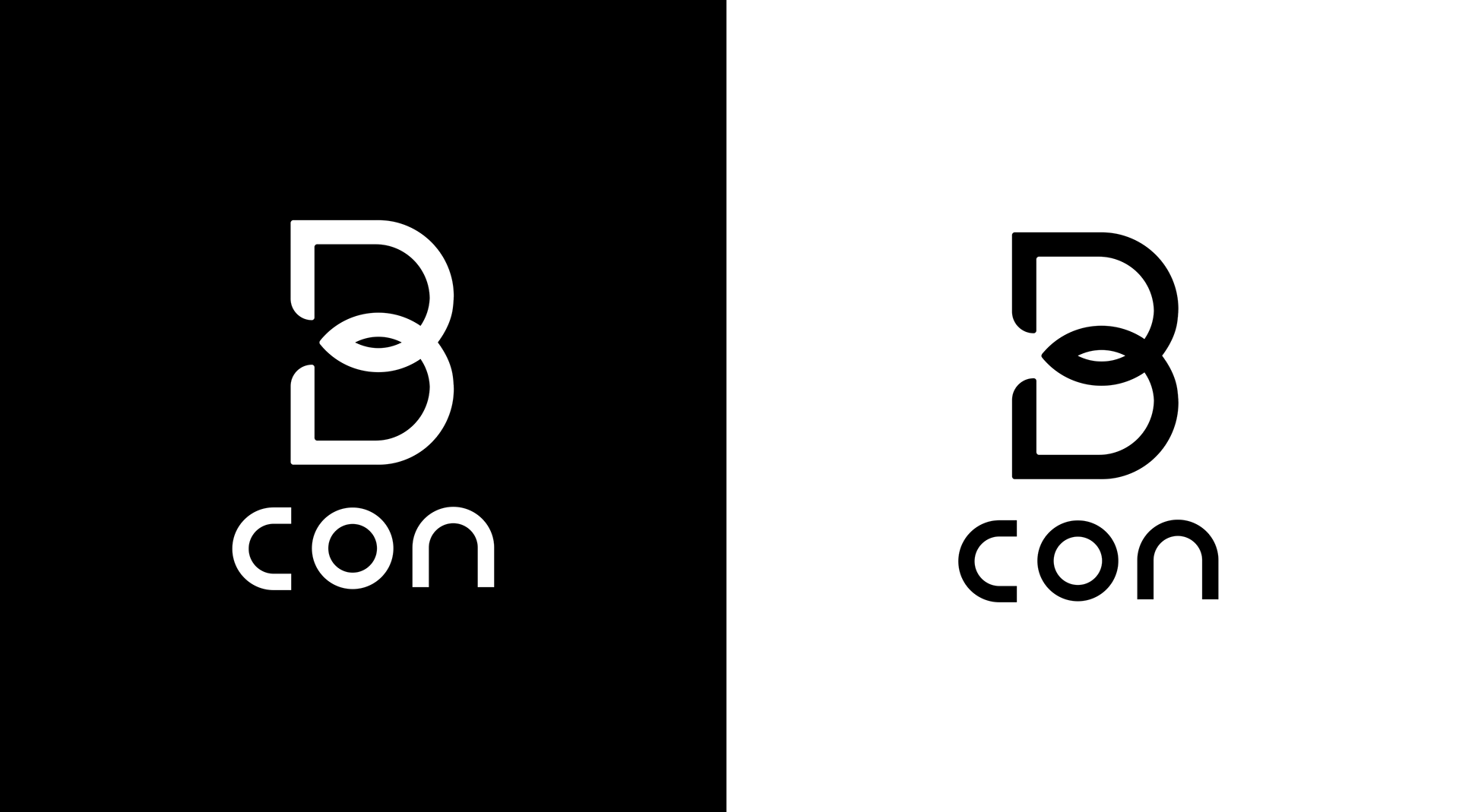
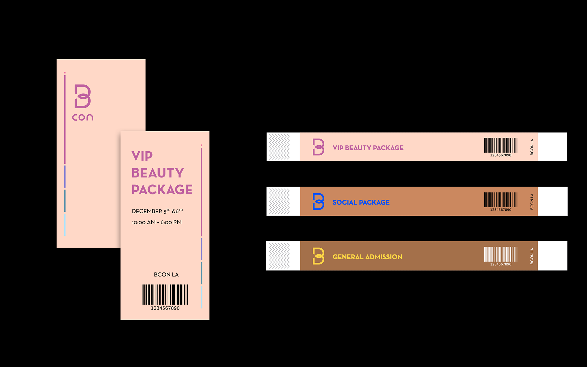
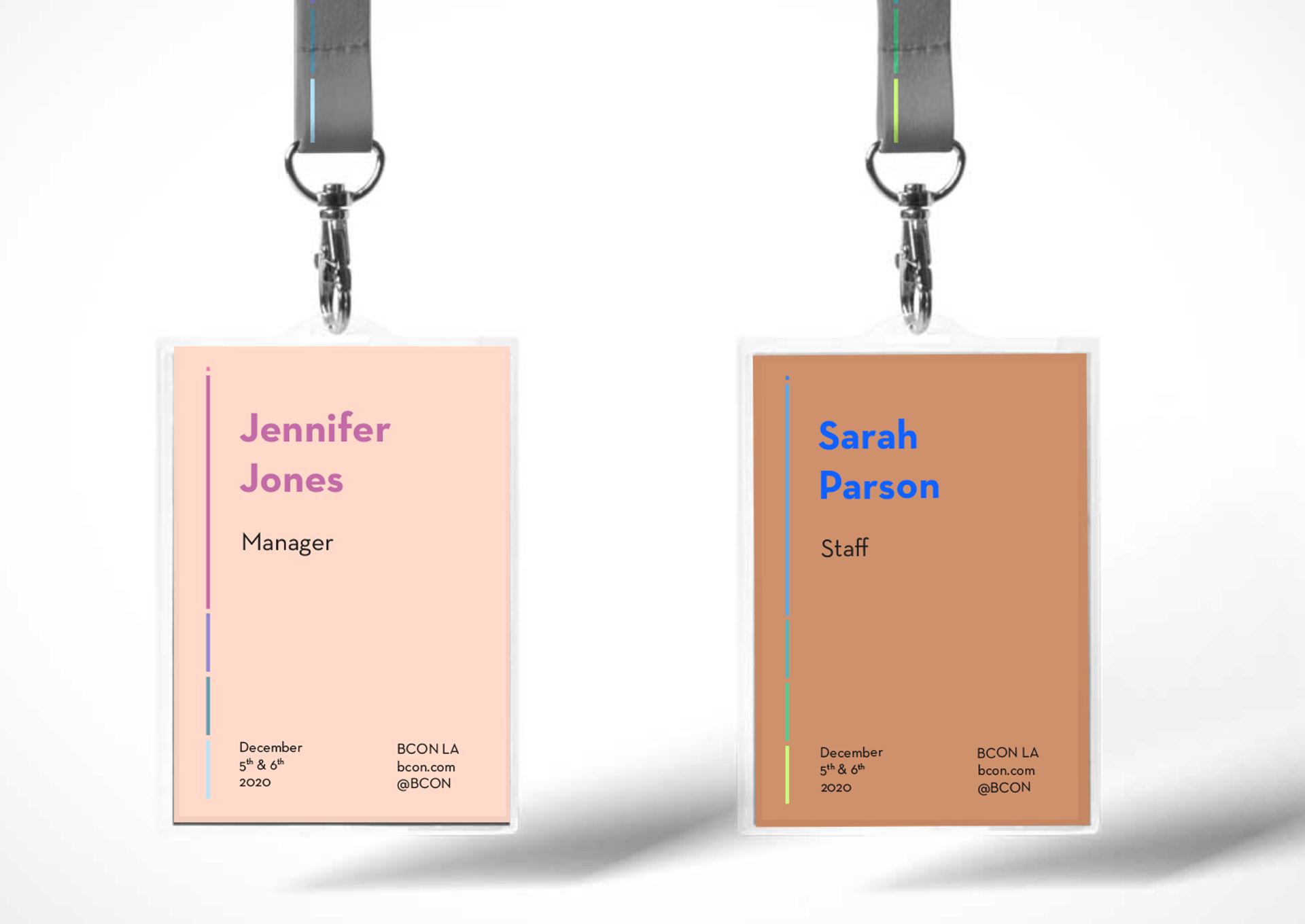
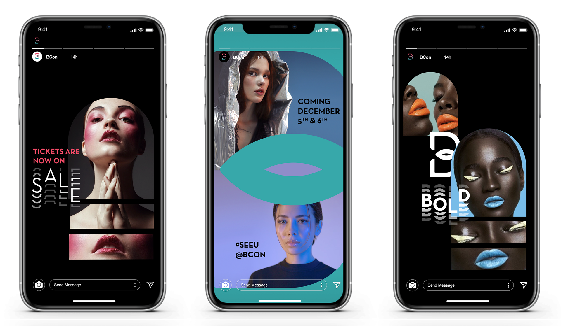
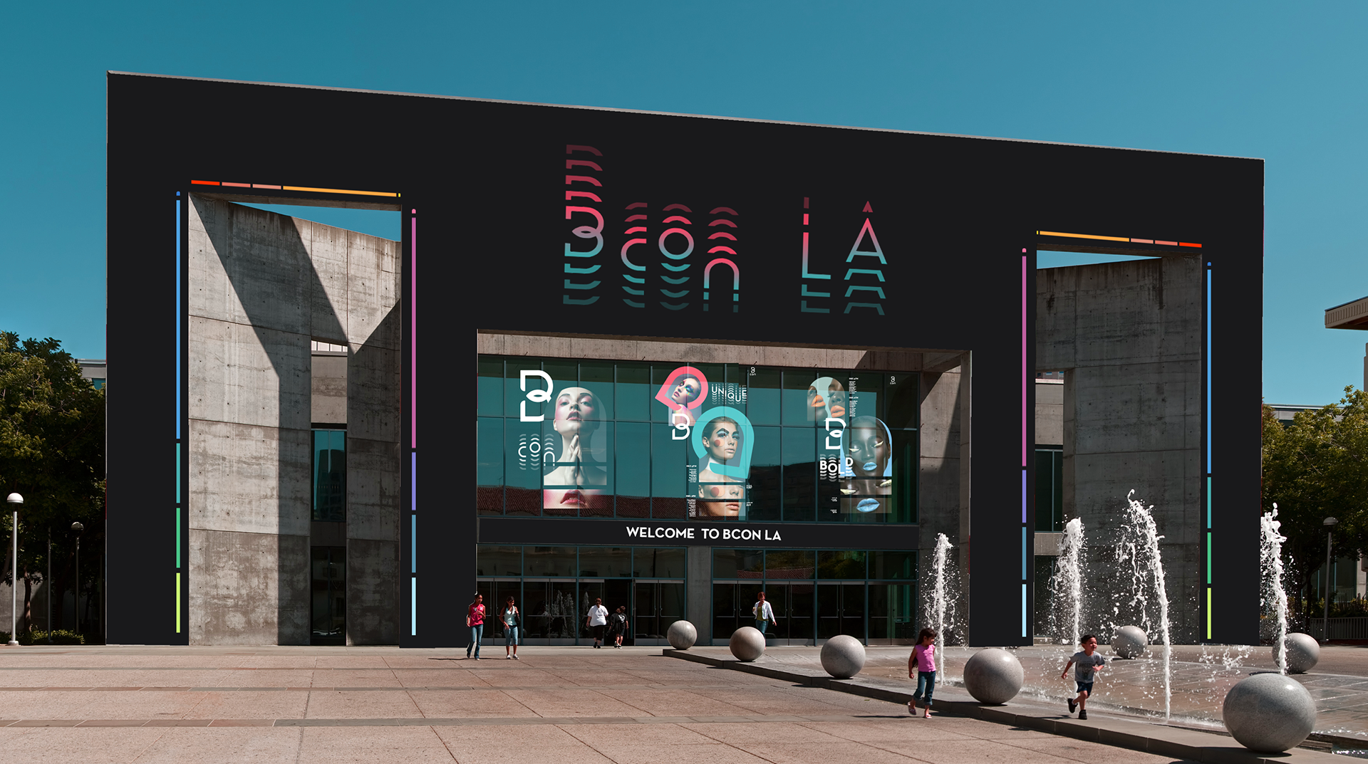
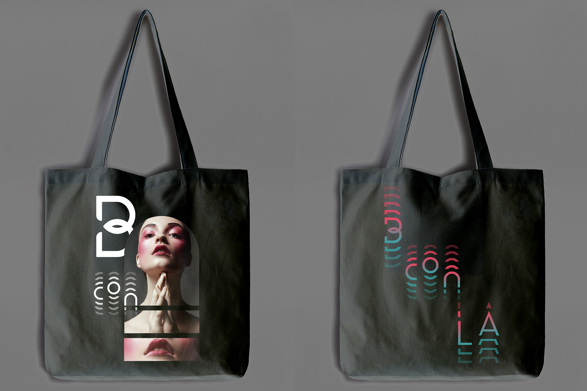
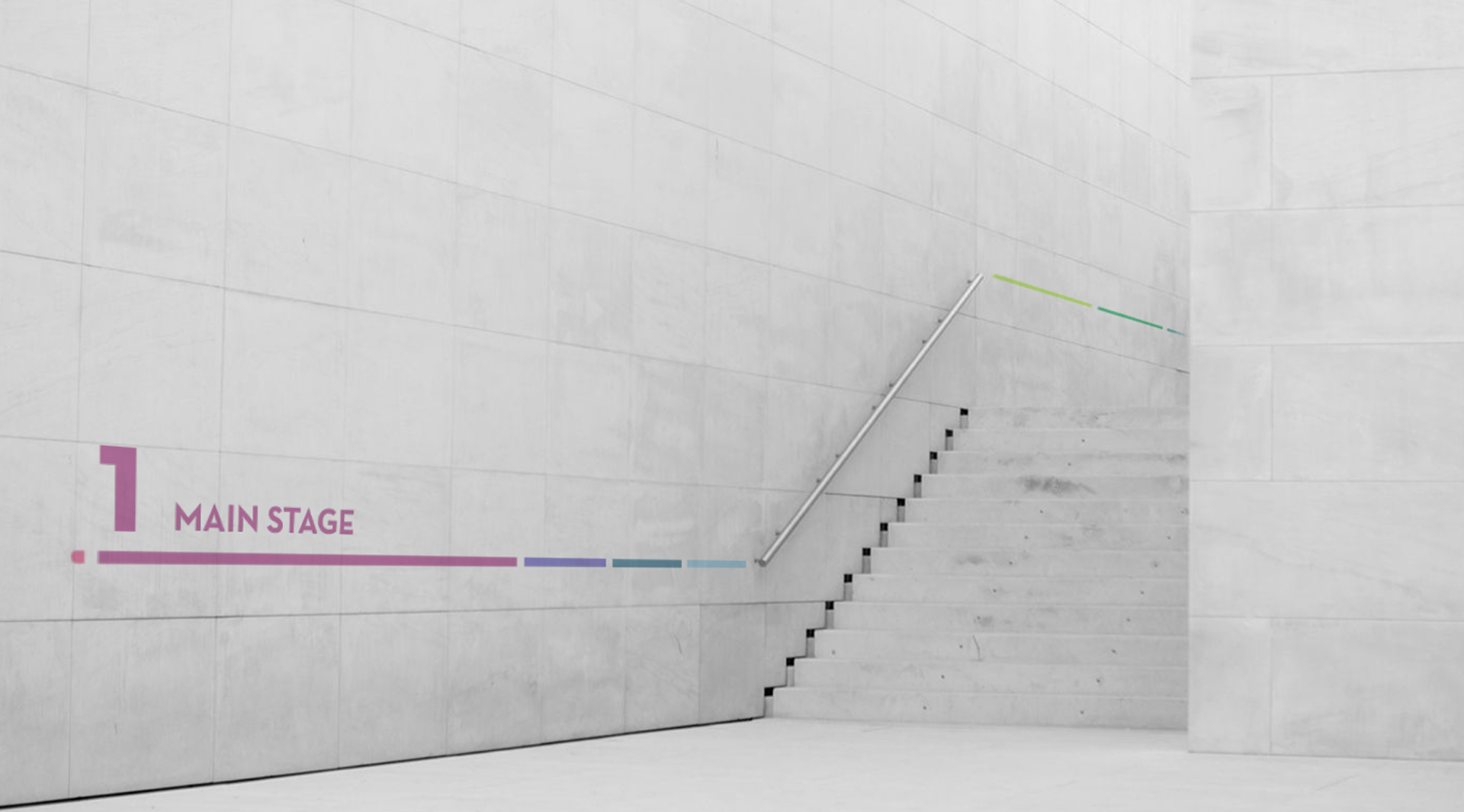
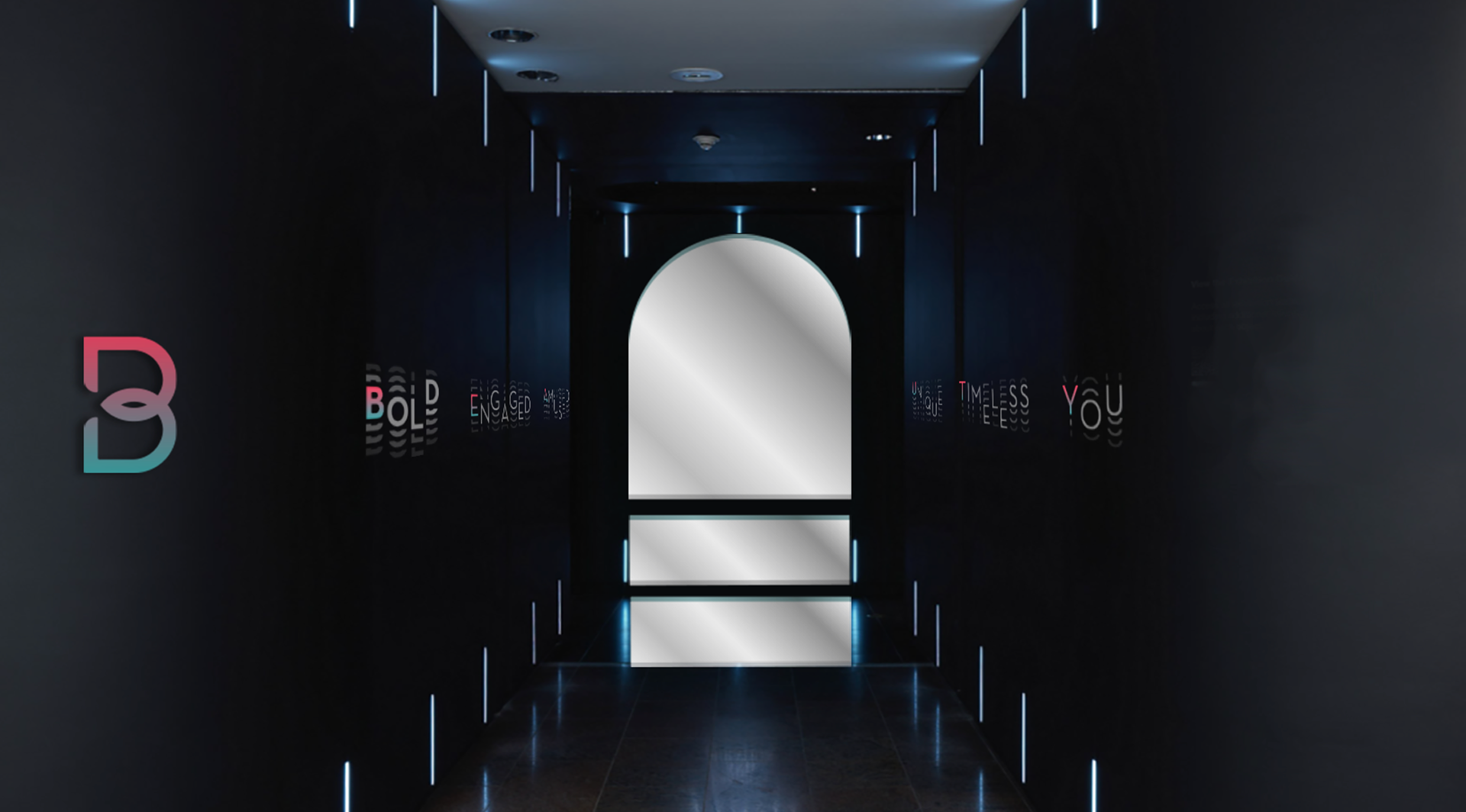
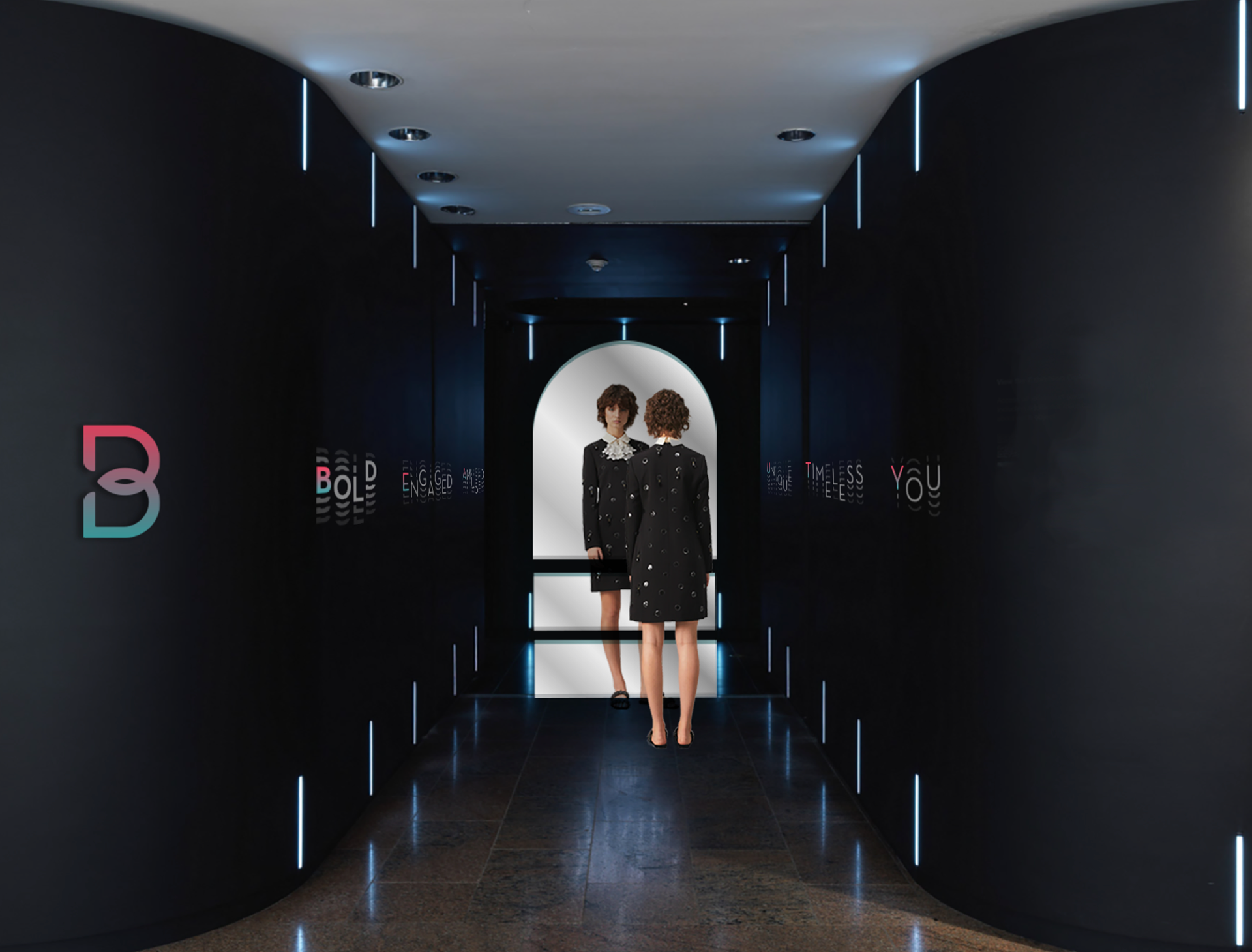
BCON is rebranding project for Beautycon. B in the logo shows the two connection between the beauty brands and people. B is reflection and the link of the shape that symbolizes a person's face. Black is mainly used to express boldness.
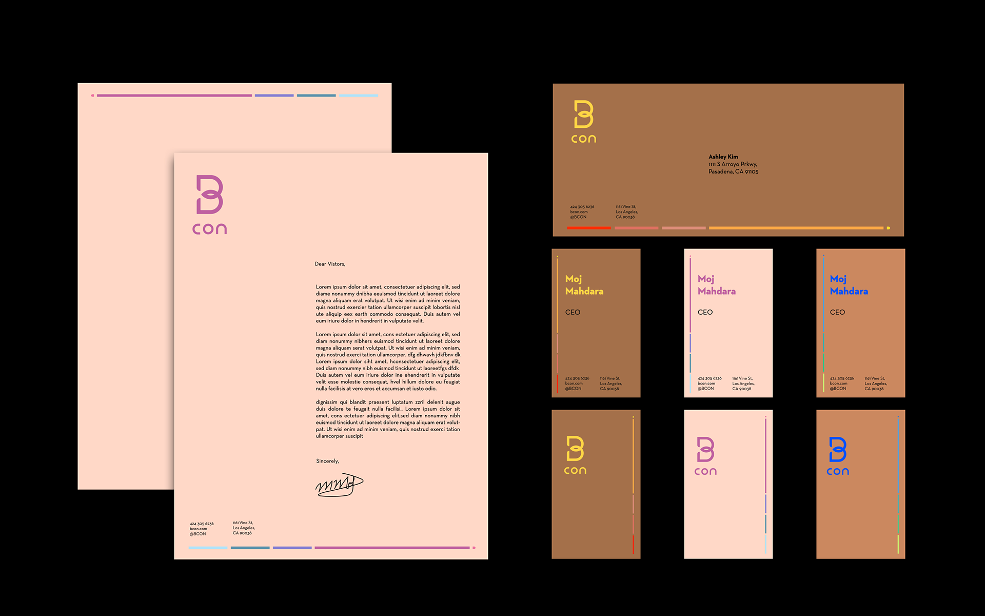
Letterhead and Business Cards
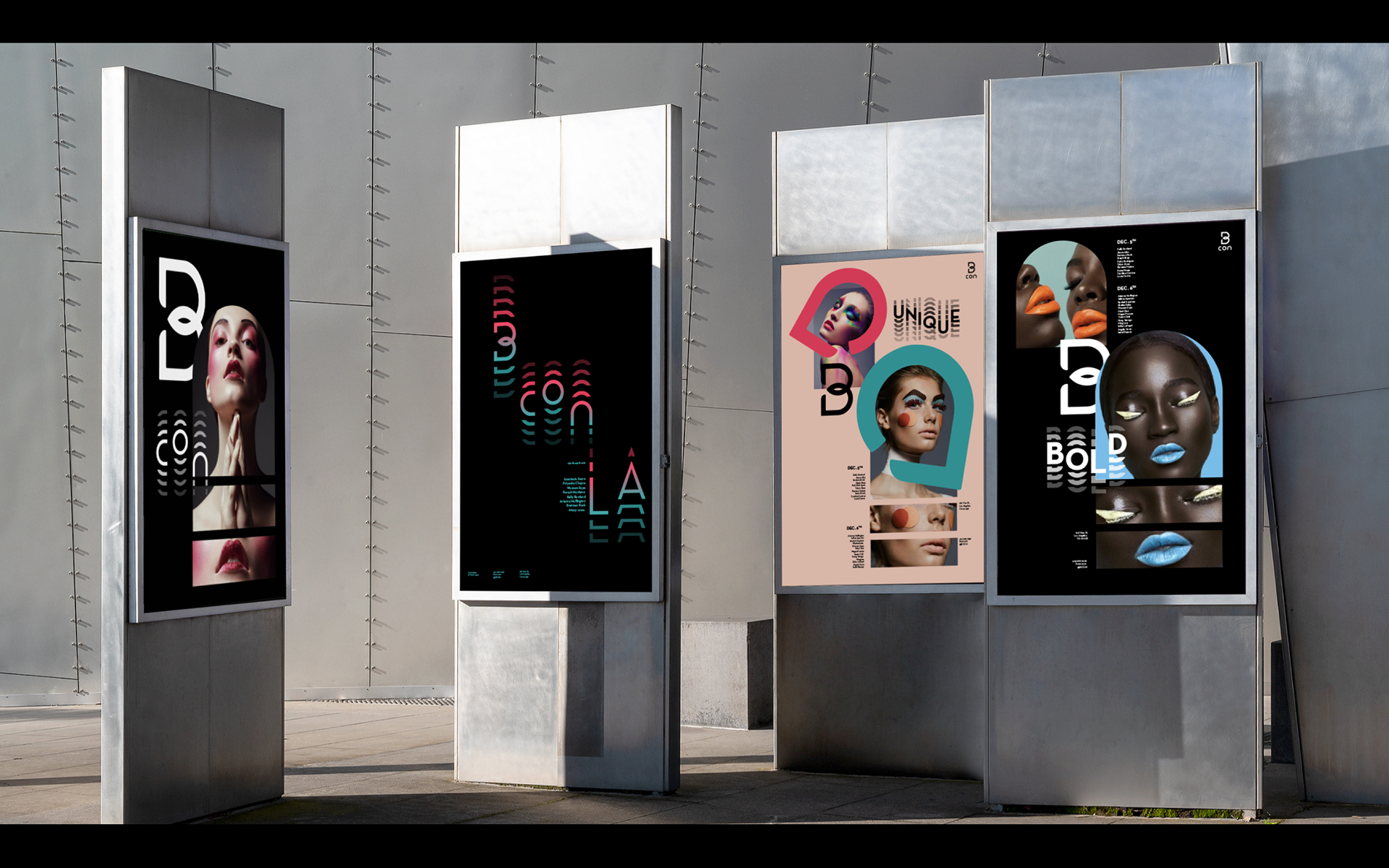
Different skin tone and bright colors are used to express variety of beauty.
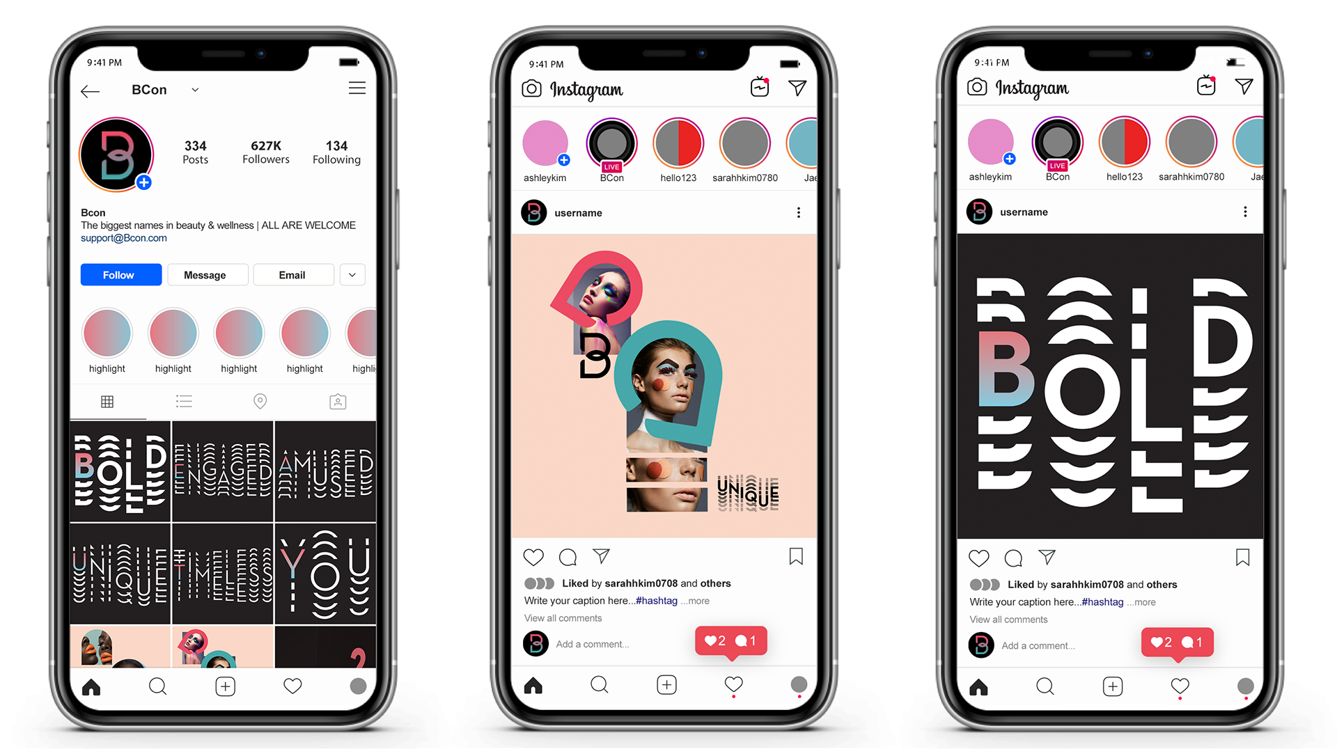
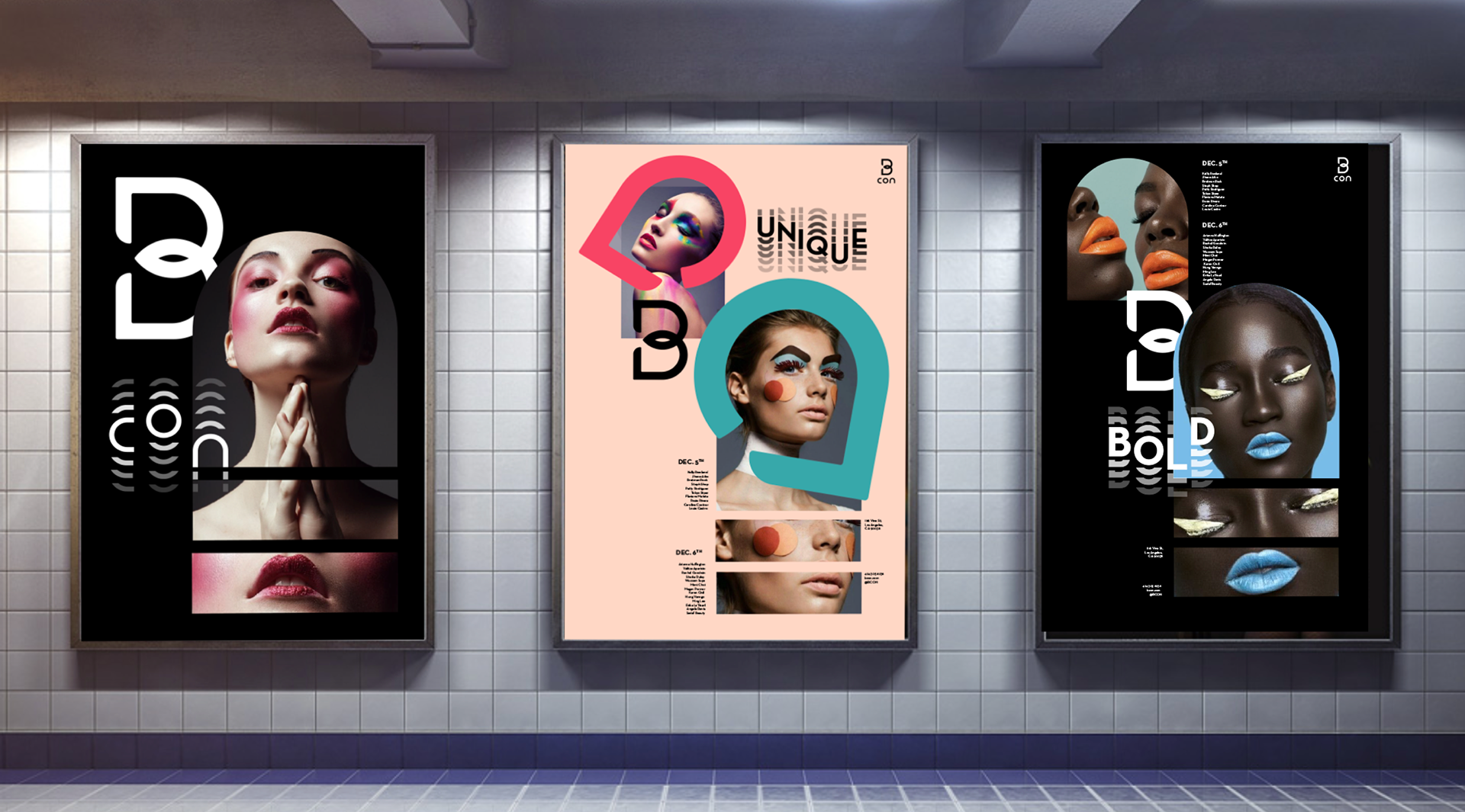
Poster Design
The poster design kept the movements of two connection between beauty brands and people.
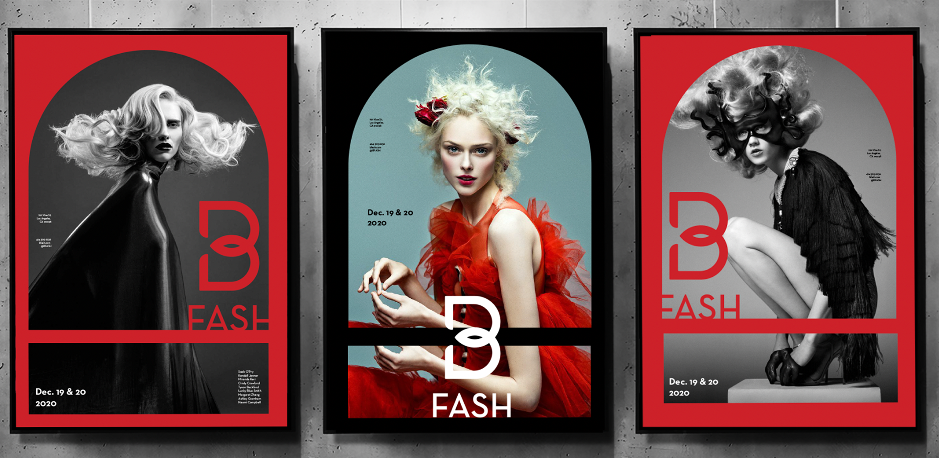
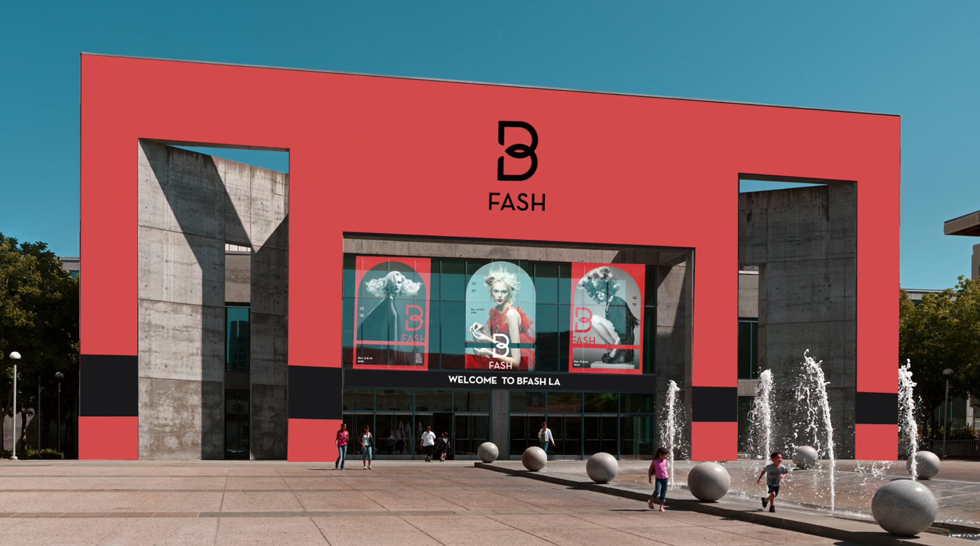
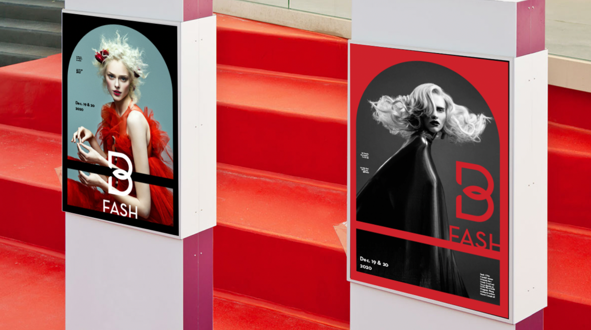
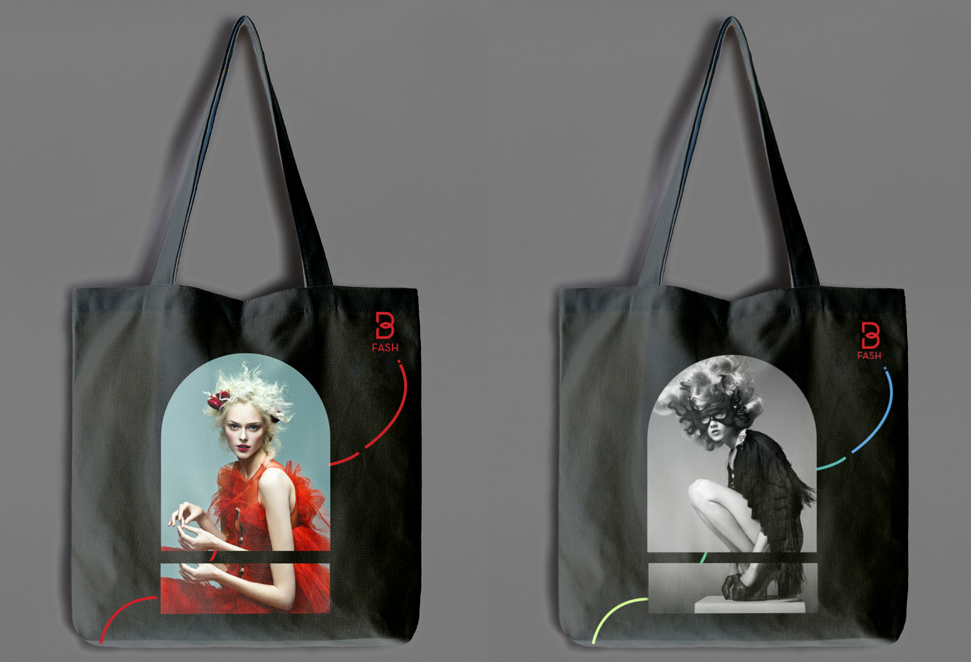
BFASH
BFASH (focusing on fashion) is sub-brand that I created for BCON.