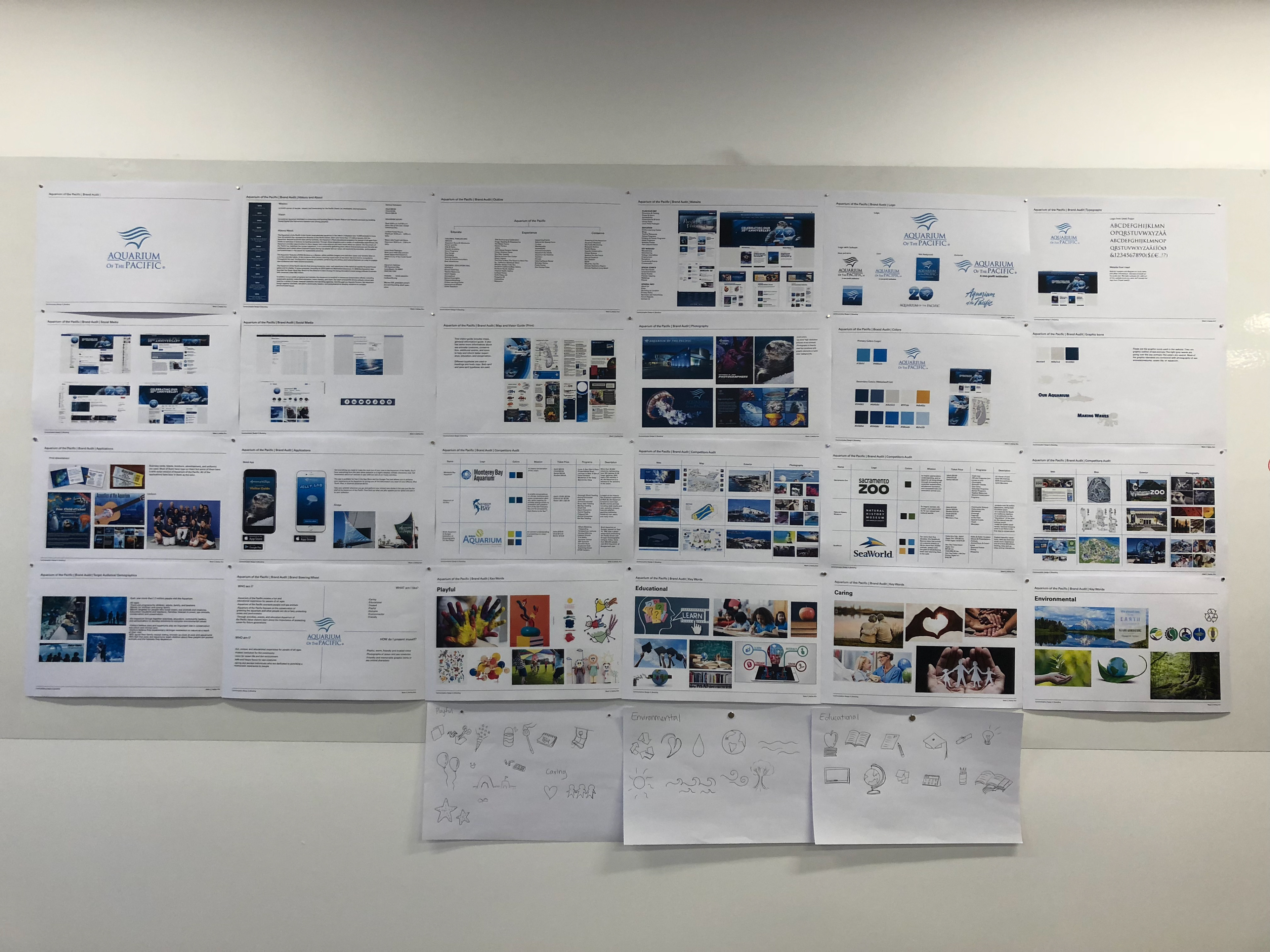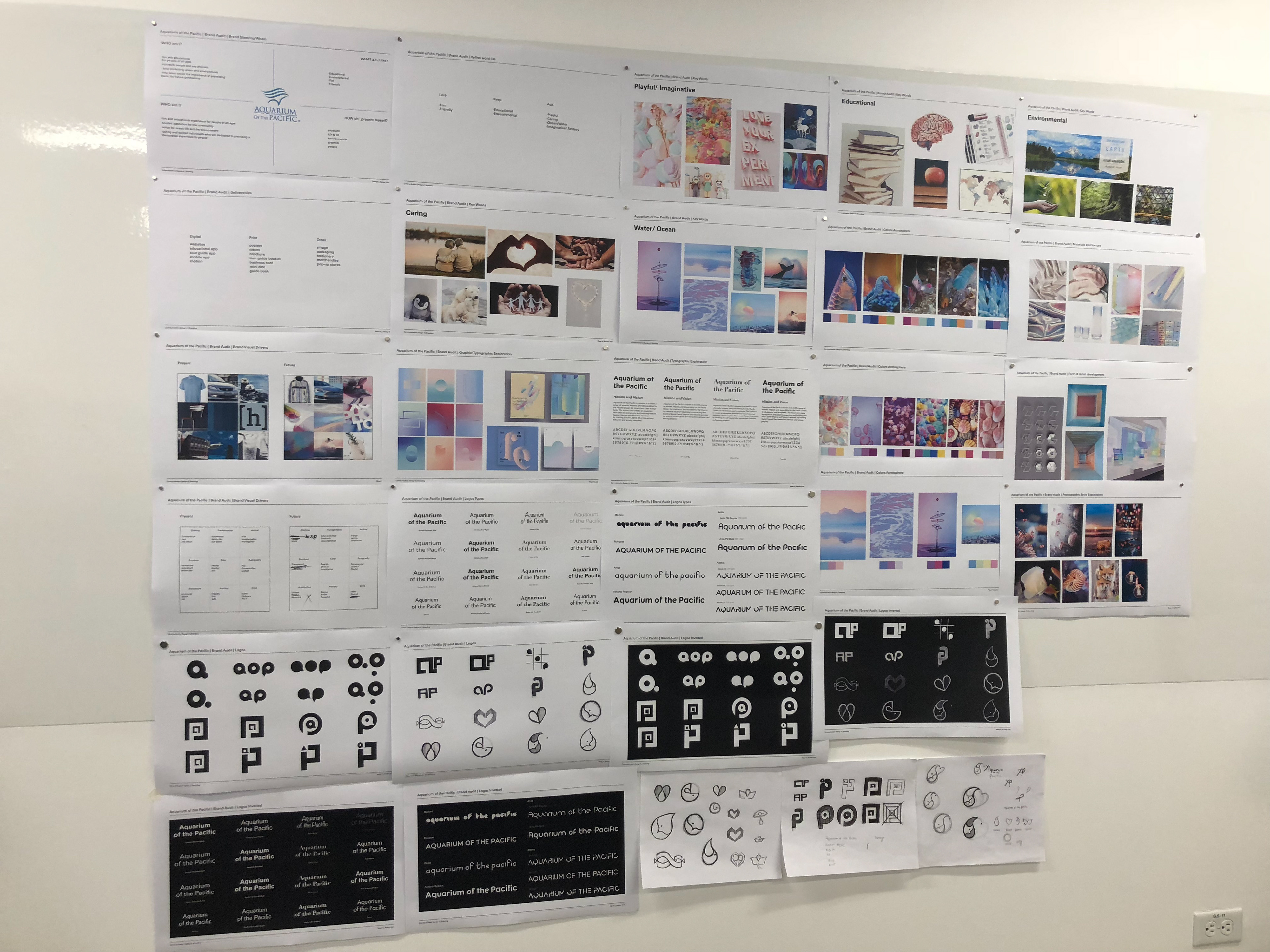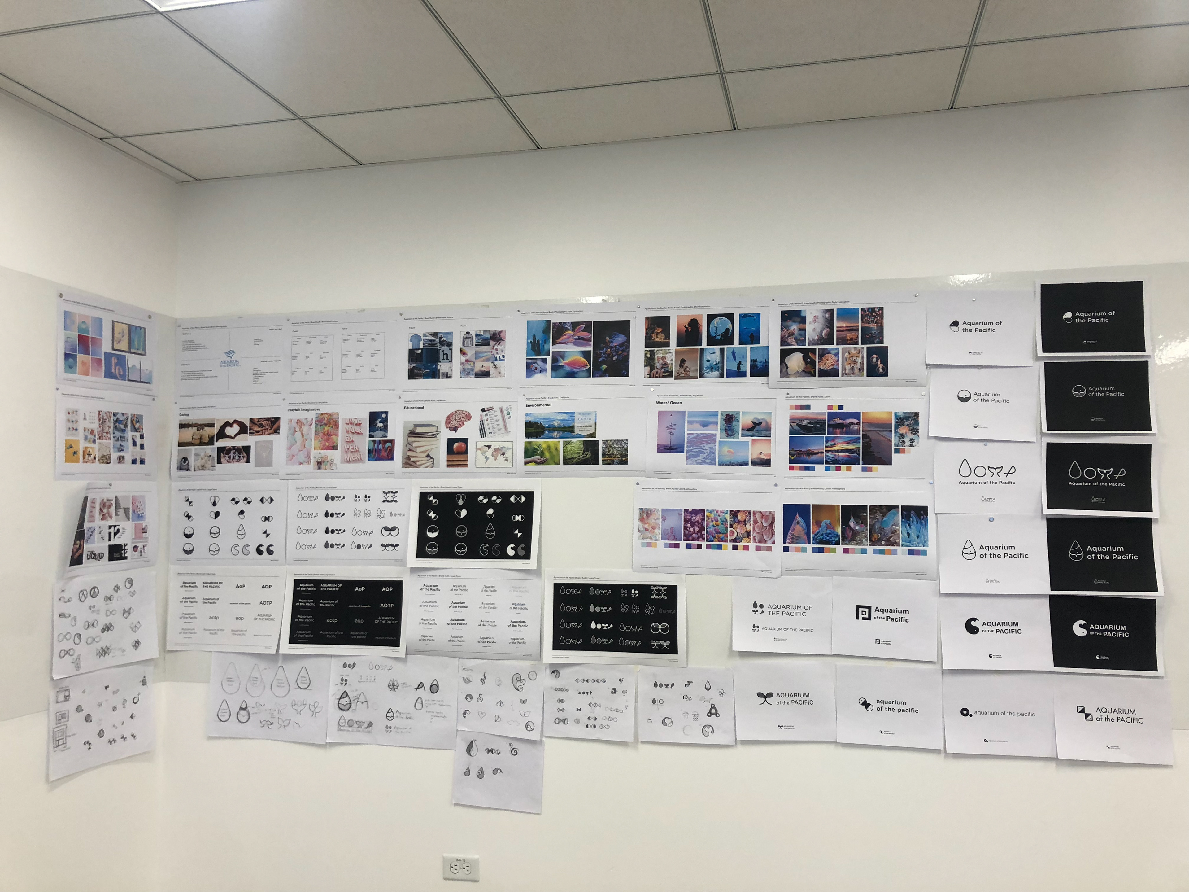
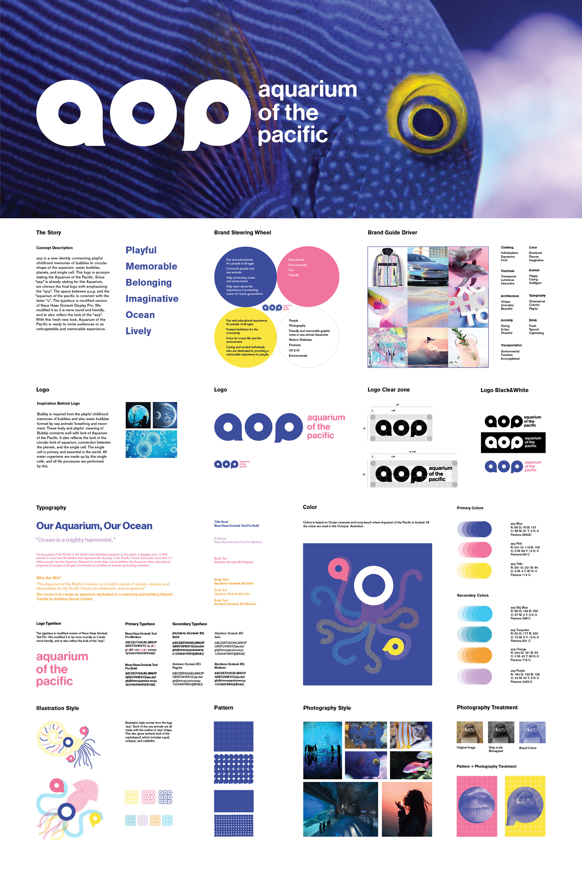
Concept
My concept was to bring out playful, memorable, and imaginative side of Aquarium of the Pacific that will also reflect their mission and value. Their main mission is “to install a sense of wonder, respect, and stewardship for the Pacific Ocean, its inhabitants, and ecosystems”. Also, their main value is “to create an aquarium dedicated to conserving and building Natural Capital.” With this fresh new look, Aquarium of the Pacific is ready to invite audiences to an unforgettable and memorable experience.
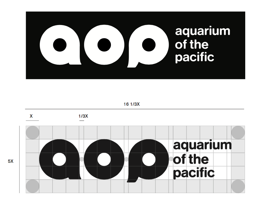
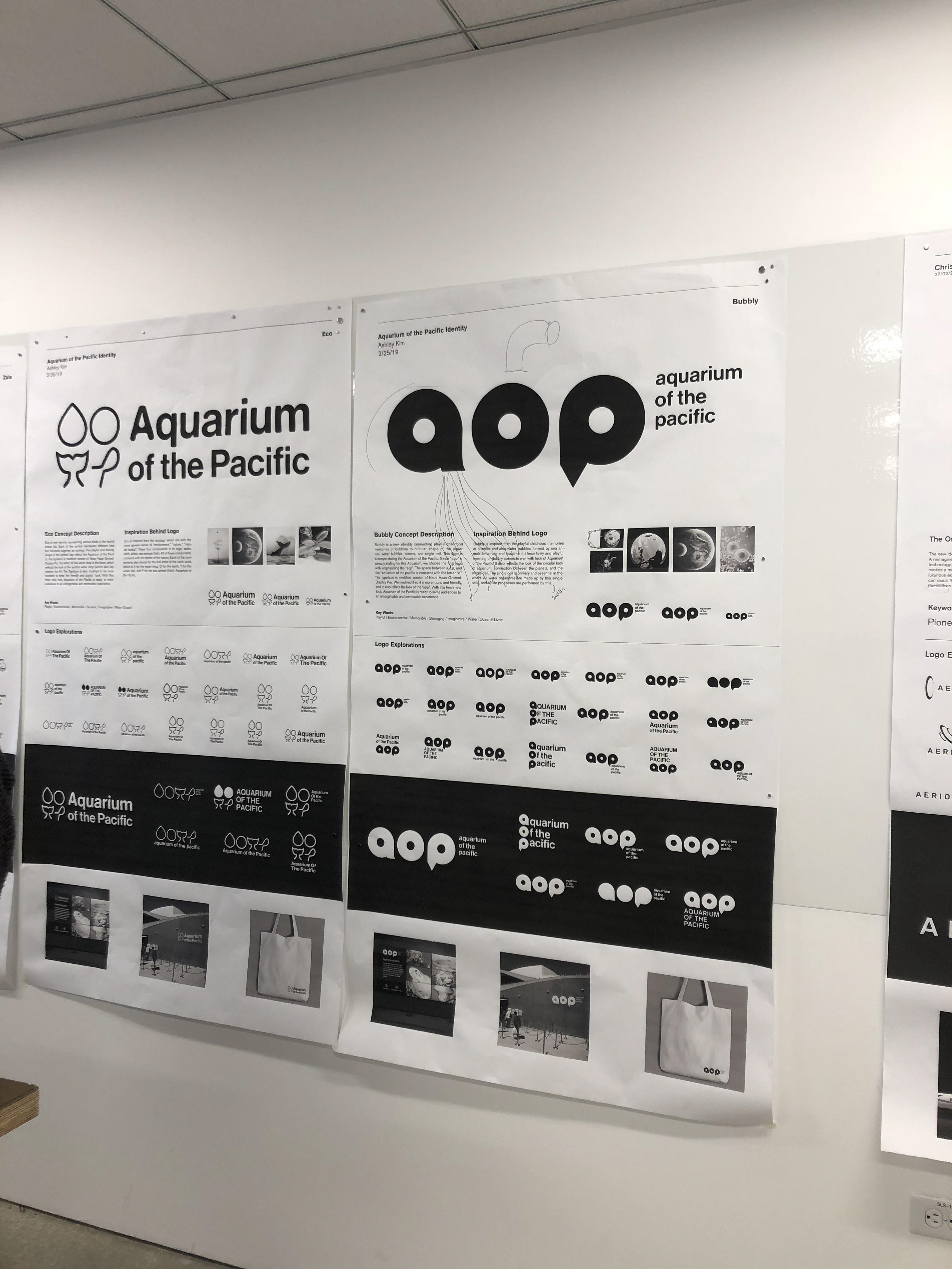
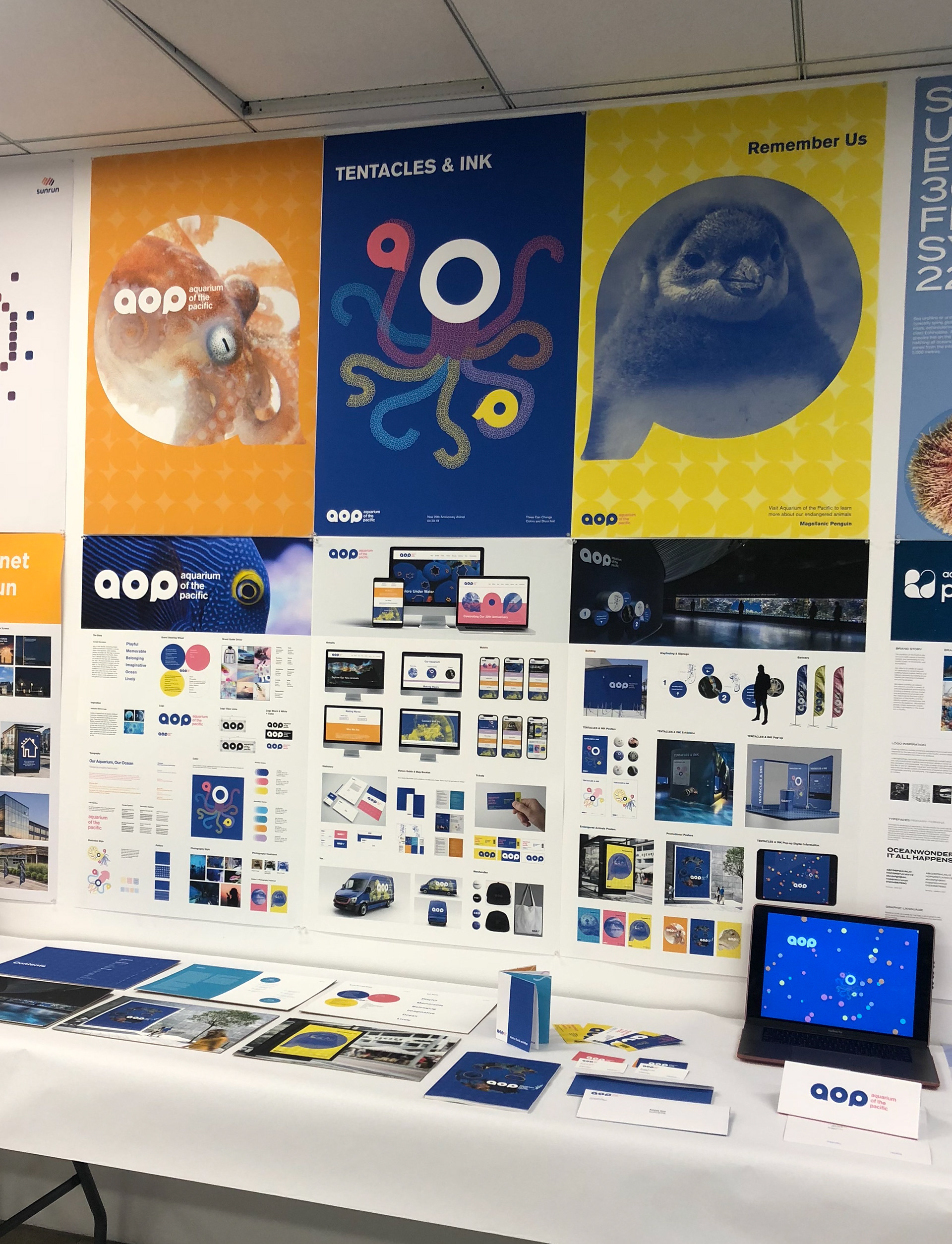
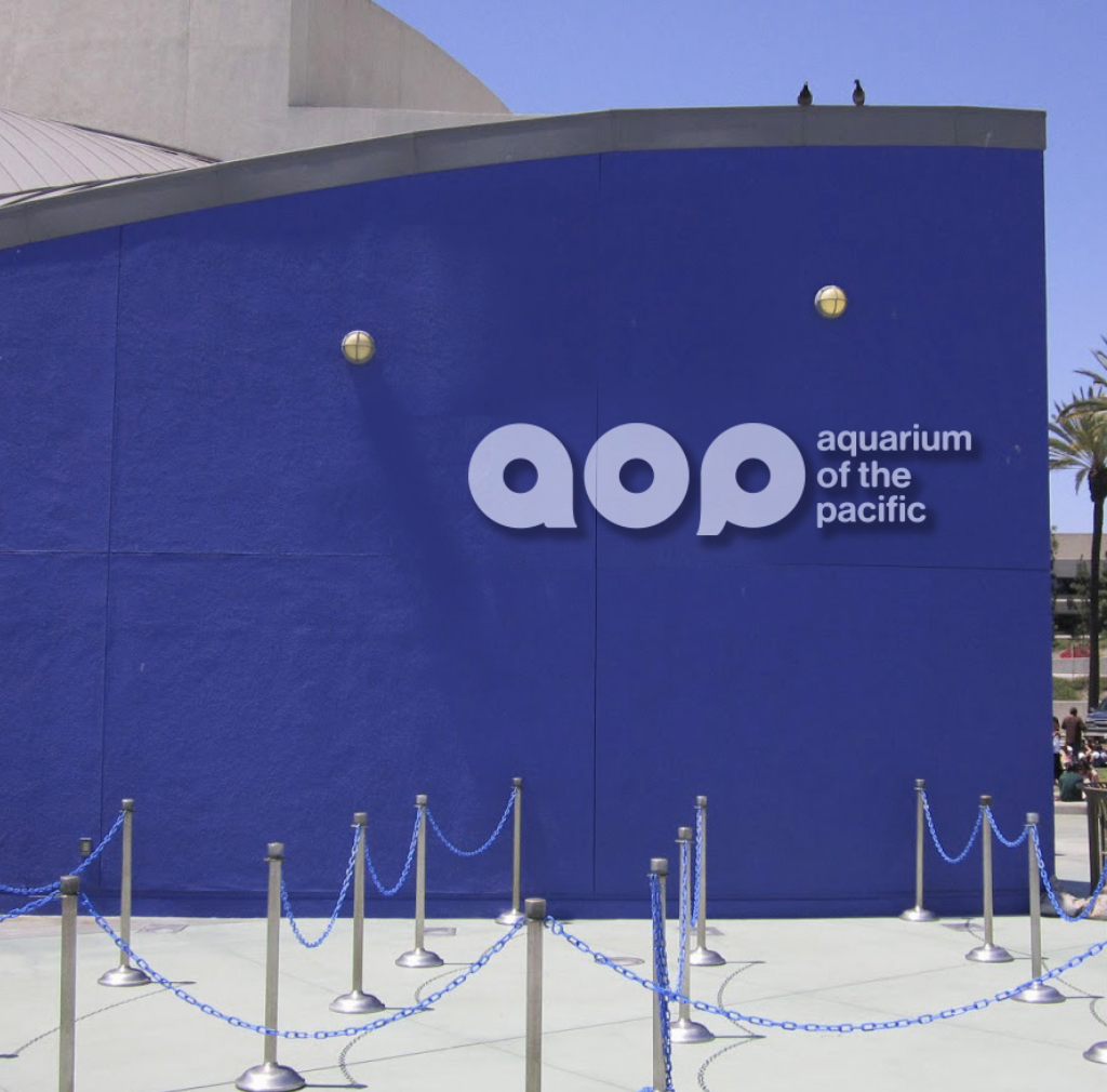
Logo
The shape of “aop” also has meaning, so it would not be just shortening for no reason. The circular shaped of “aop” reflects a lot of circular forms in aquarium, such as circular windows for aquarium and submarine. Also it reflects the look of single cell to planet, which relates to how aquarium has smallest organism to giant sea animal. Understanding the fact that it would take quite a long time to instantly refer “aop” as Aquarium of the Pacific, I also put word mark logo next that was also modified to reflect the look of “aop”.
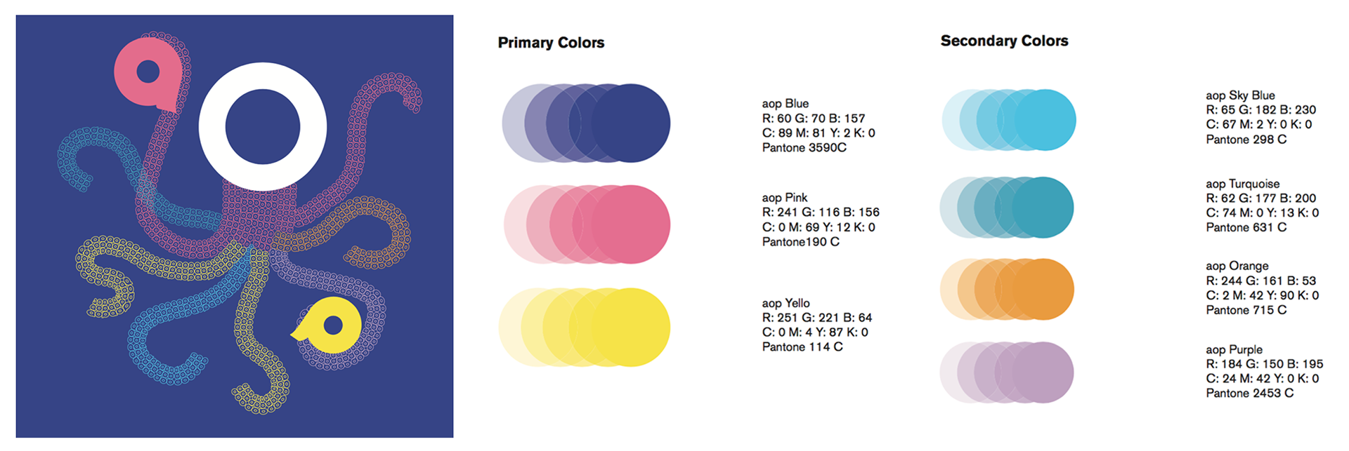
Colors
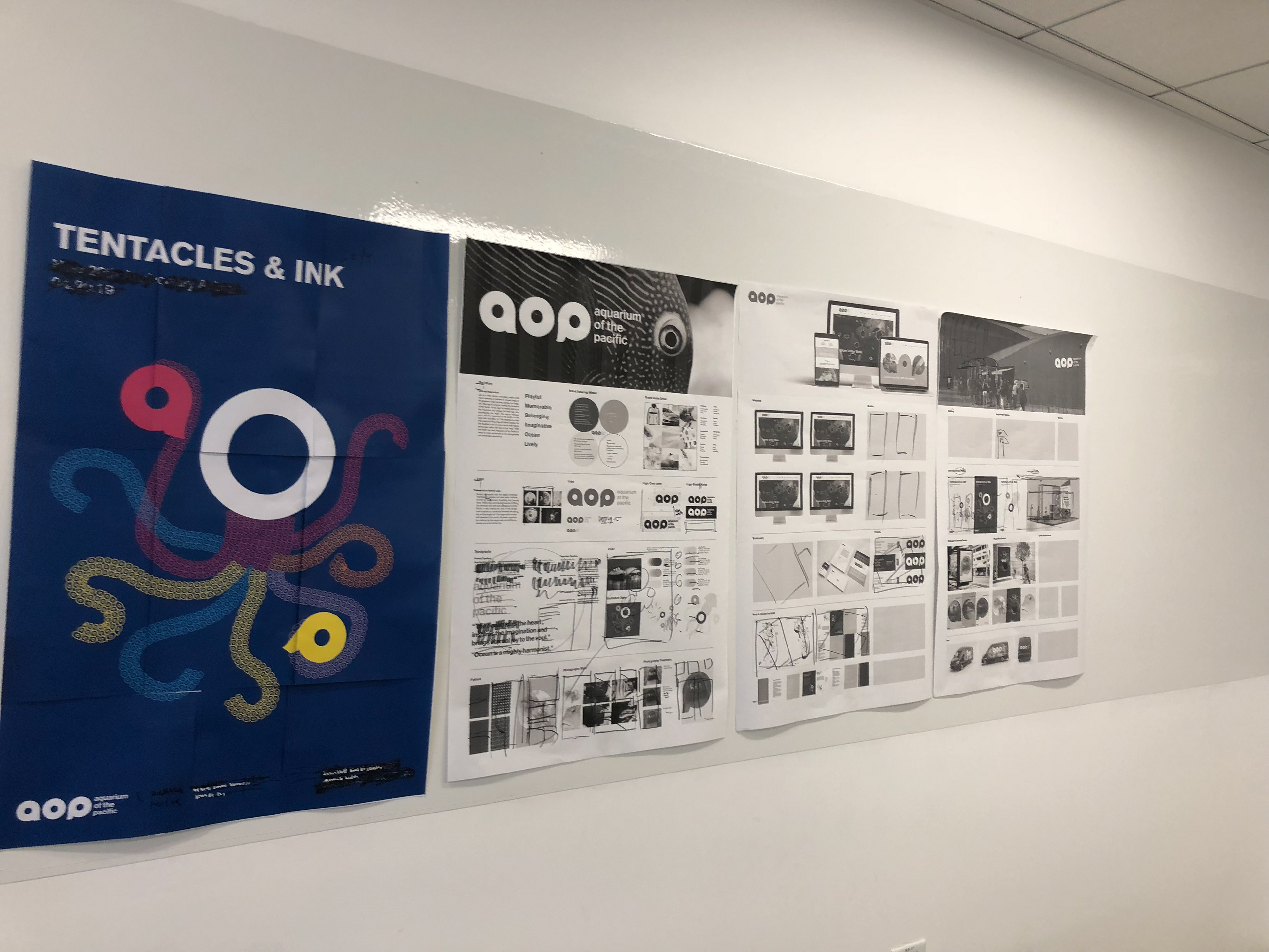
Colors are based on Ocean creatures and Long beach where Aquarium of the Pacific is located. All the colors are used in this Octopus illustration.
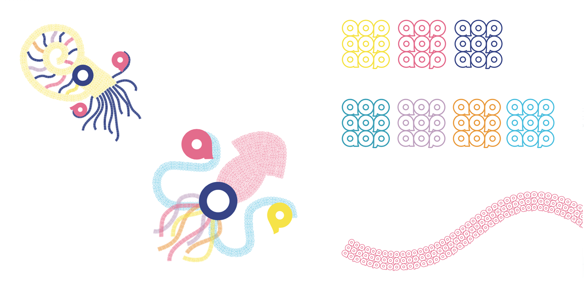
Illustration Style
The pattern for aop logo is used for the illustration. It evokes a tentacle, and each of the sea animal characters have a,o,p with them.
The pattern for aop logo is used for the illustration. It evokes a tentacle, and each of the sea animal characters have a,o,p with them.
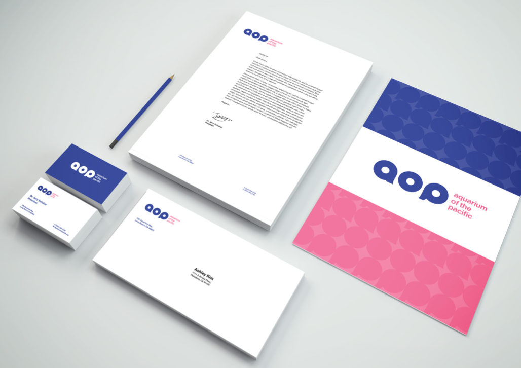
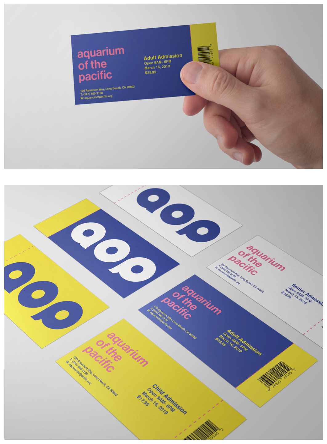
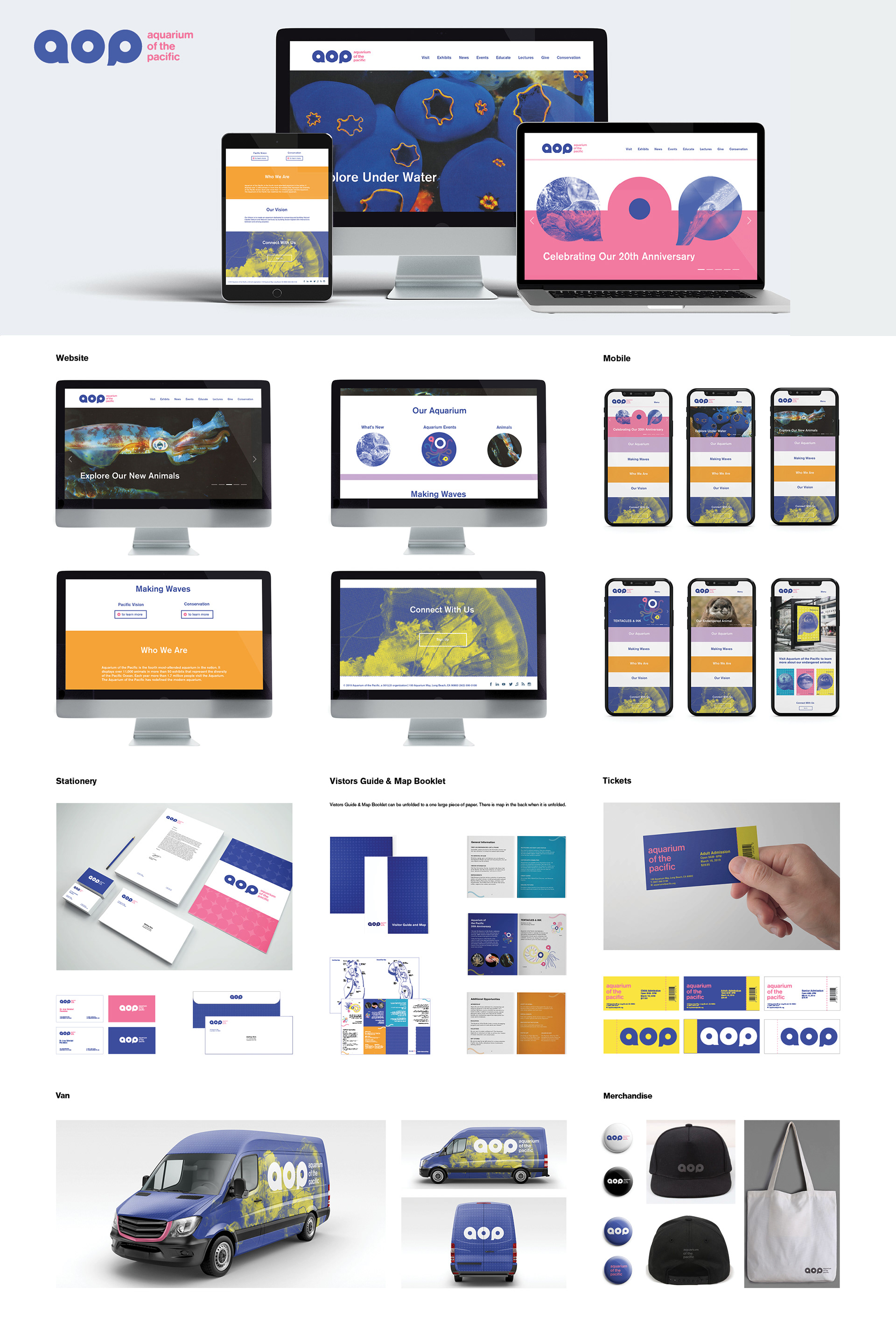
Print Designs
Primary colors are used in the letterhead, business cards, and tickets. Patterns are used in the back of letterhead. Tickets for different age group is easily differentiate with the colors.
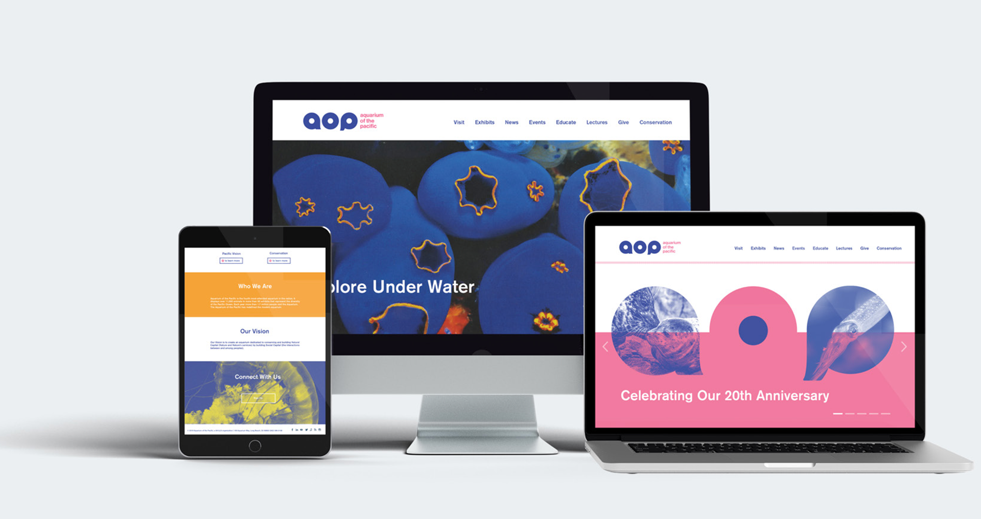
Website
Variety of colors and image treatments are used for the website to keep the playful aspect of the Aquarium of the Pacific.
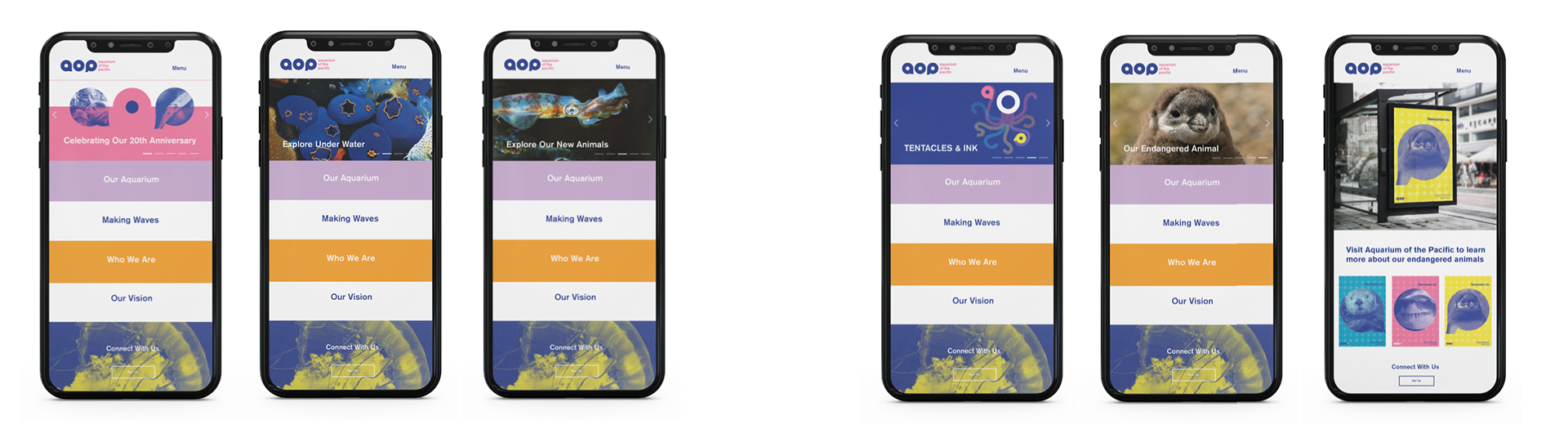
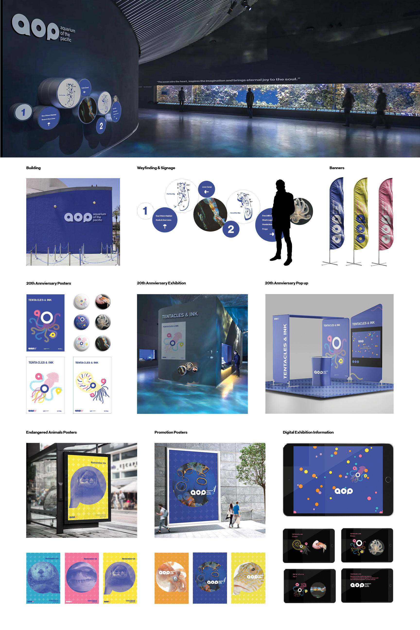
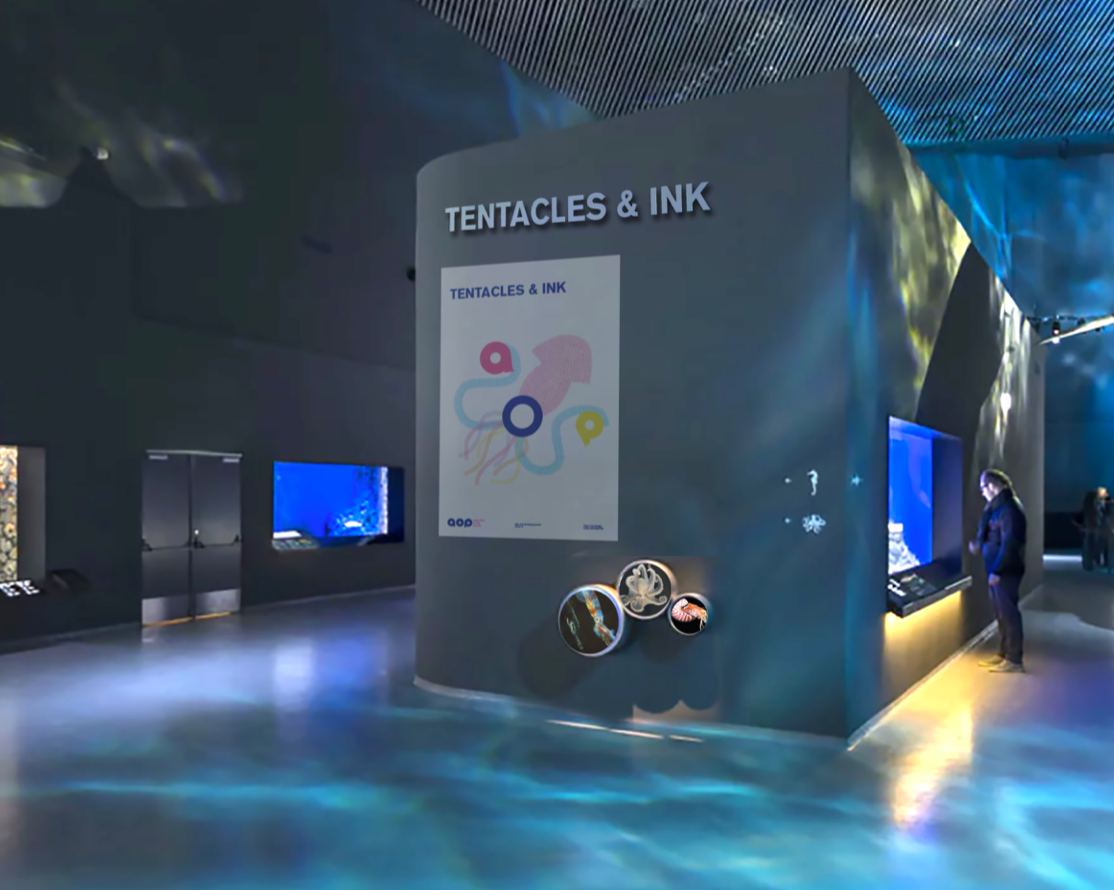
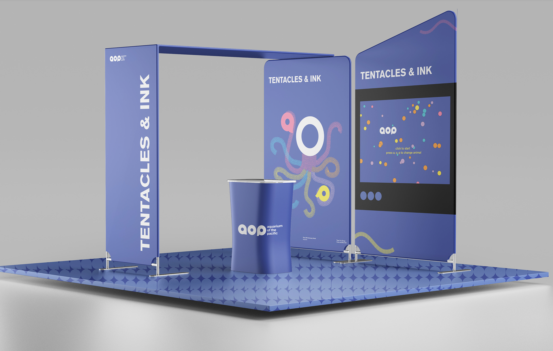
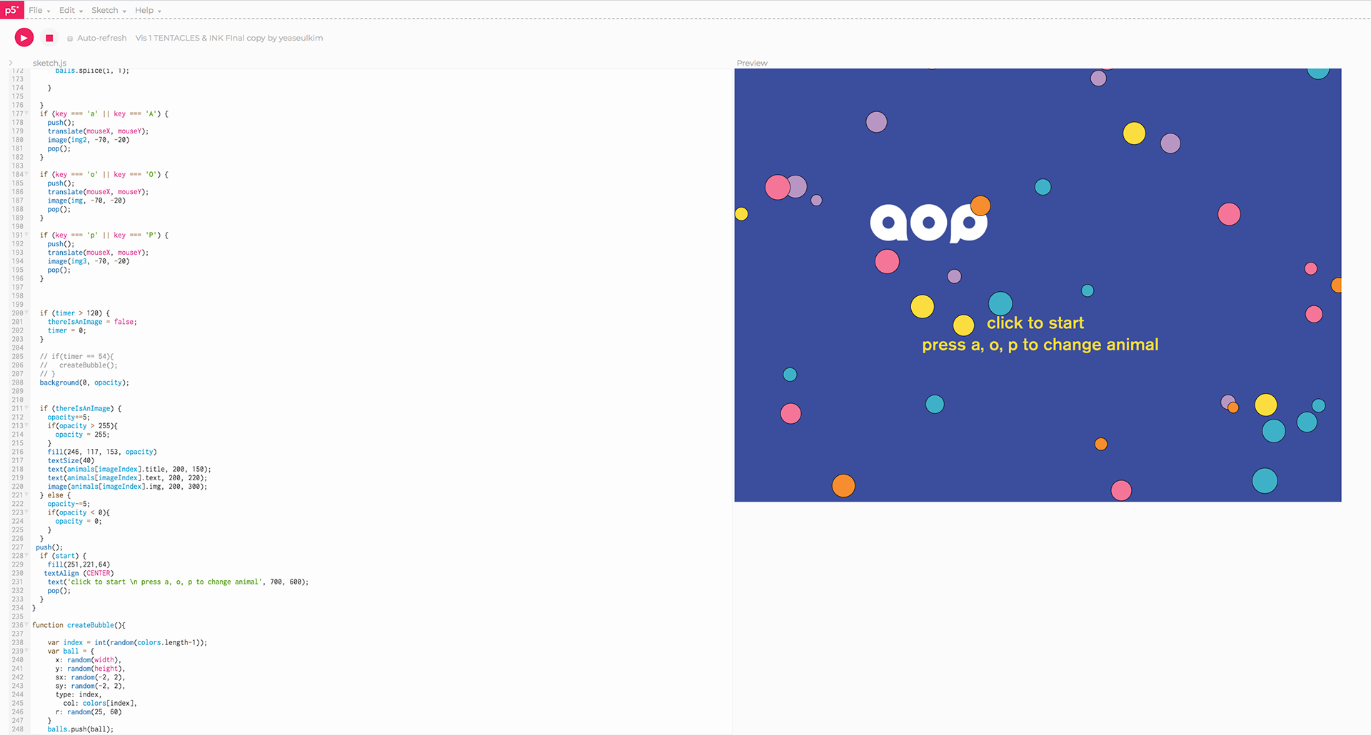
Tentacles & Ink Exhibition Interface
This is the Tentacles and Ink exhibition interface. It will promote new 20th anniversary animal cephalopods including squid, octopus, and cuttlefish. They can change colors and shoot ink.
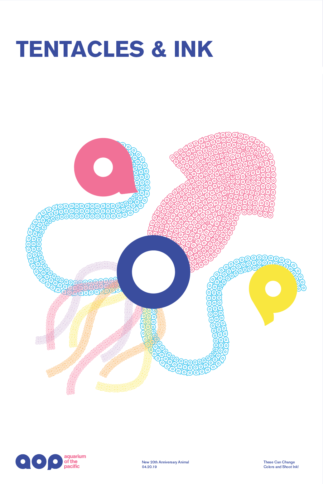
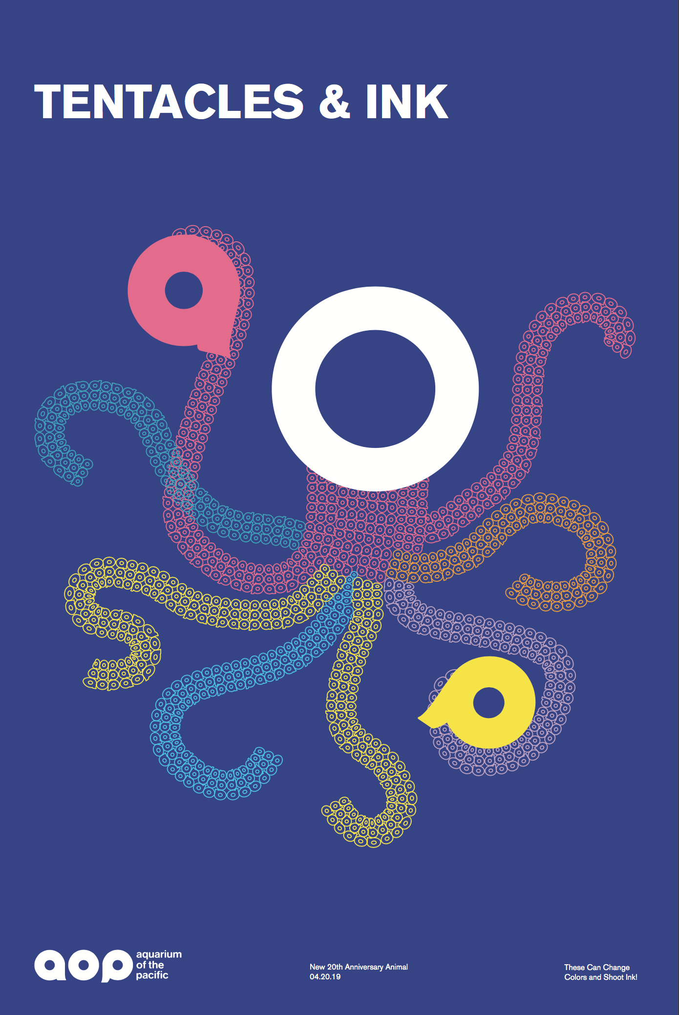
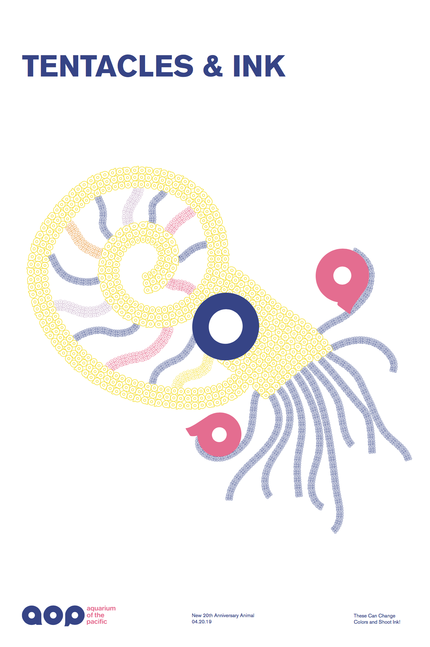
Poster
Poster to promote Tentacles & Ink Exhibition.
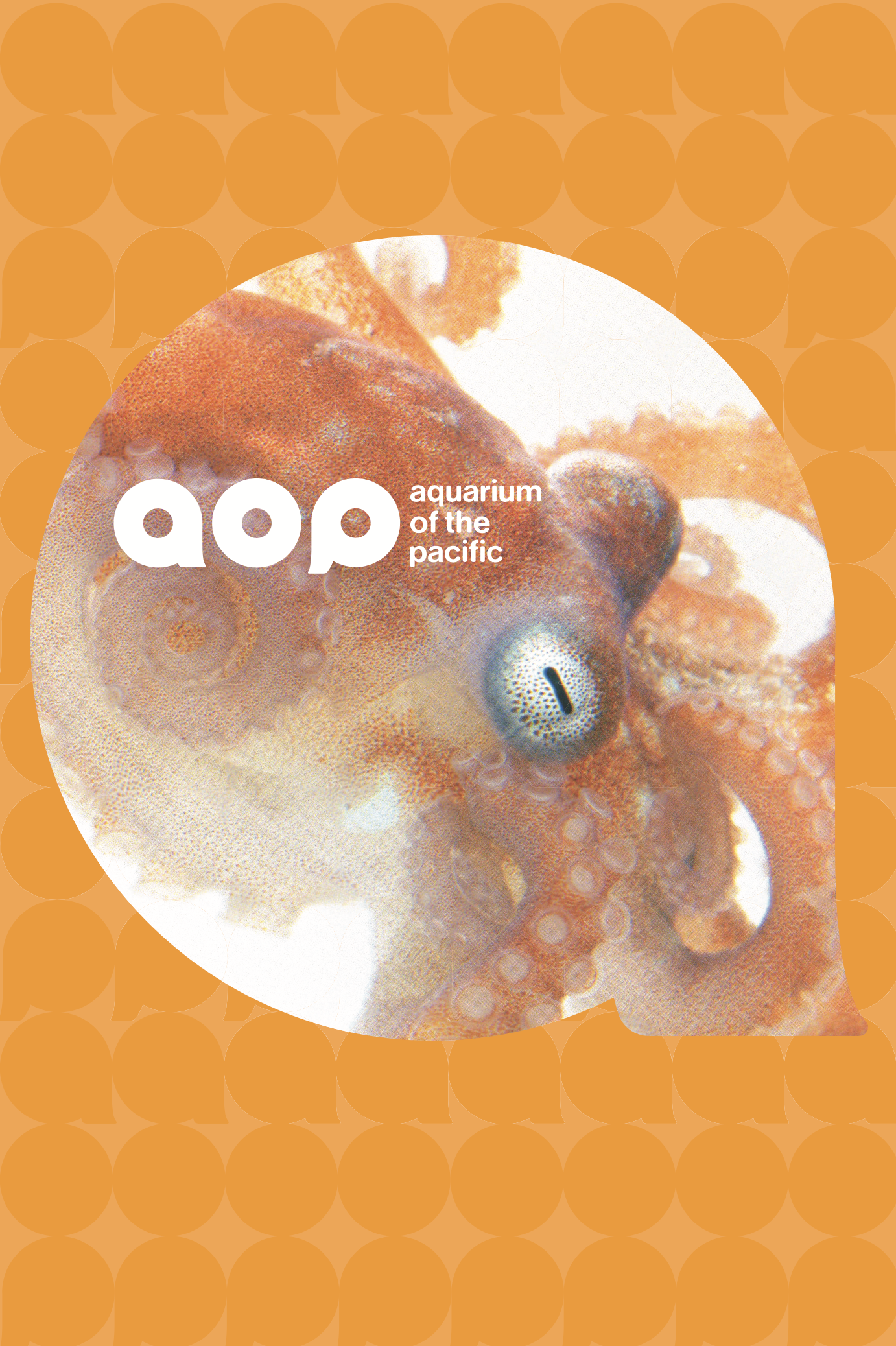
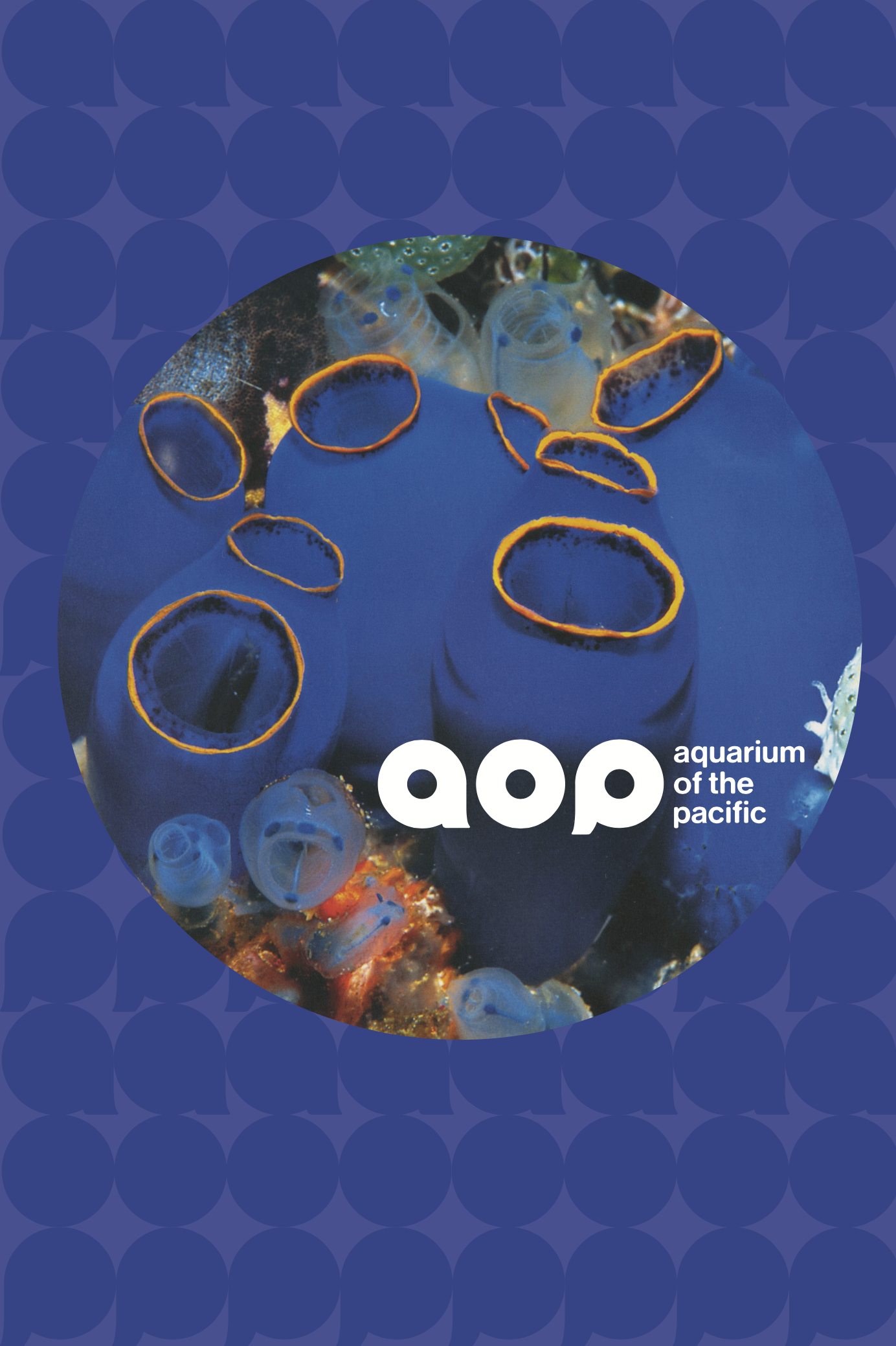
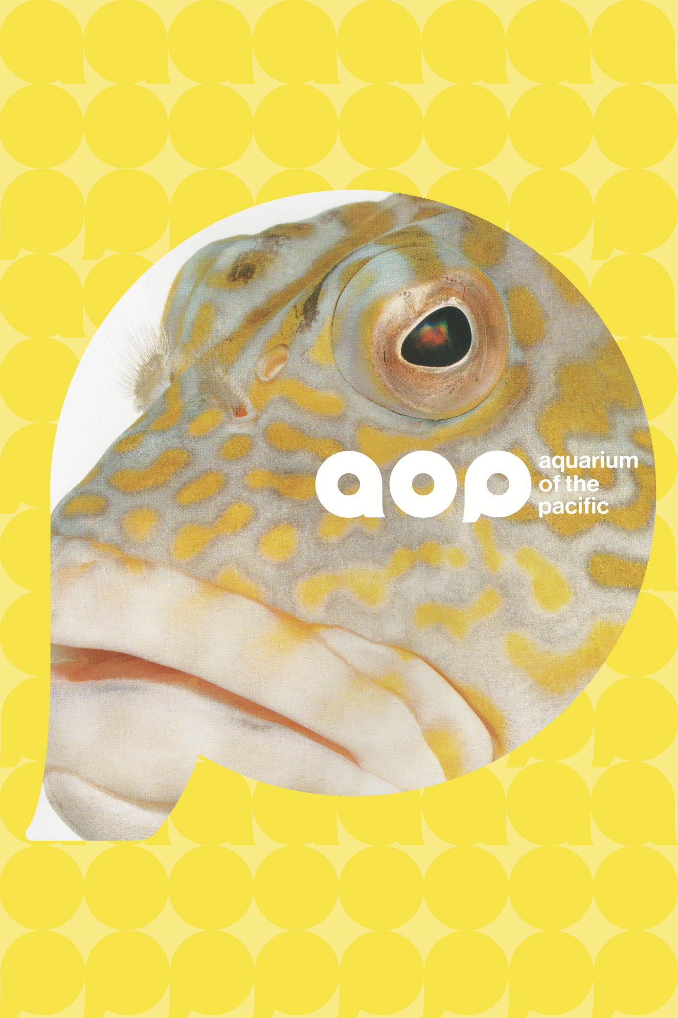
Poster
Poster to Promote Aquarium of the Pacific.
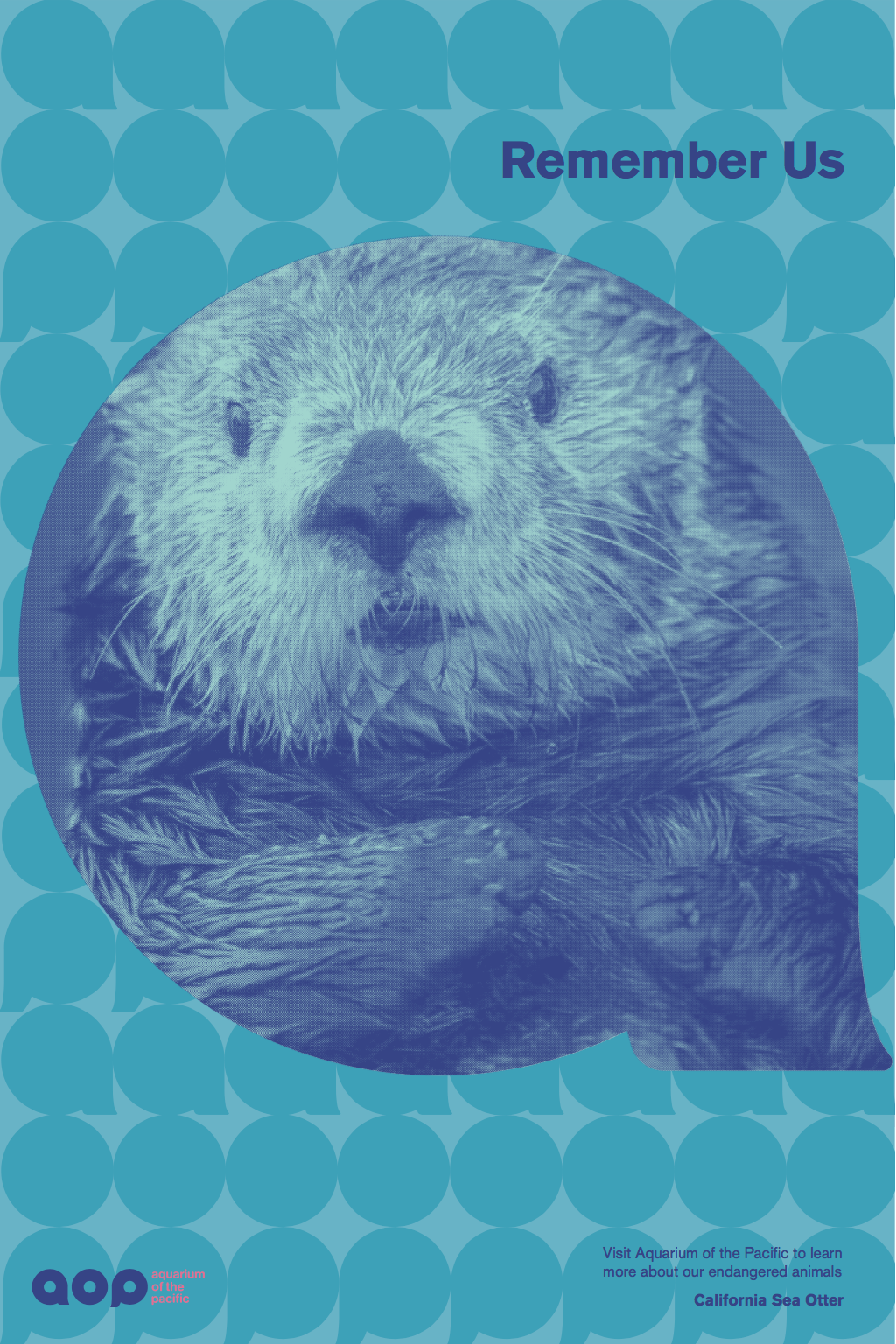
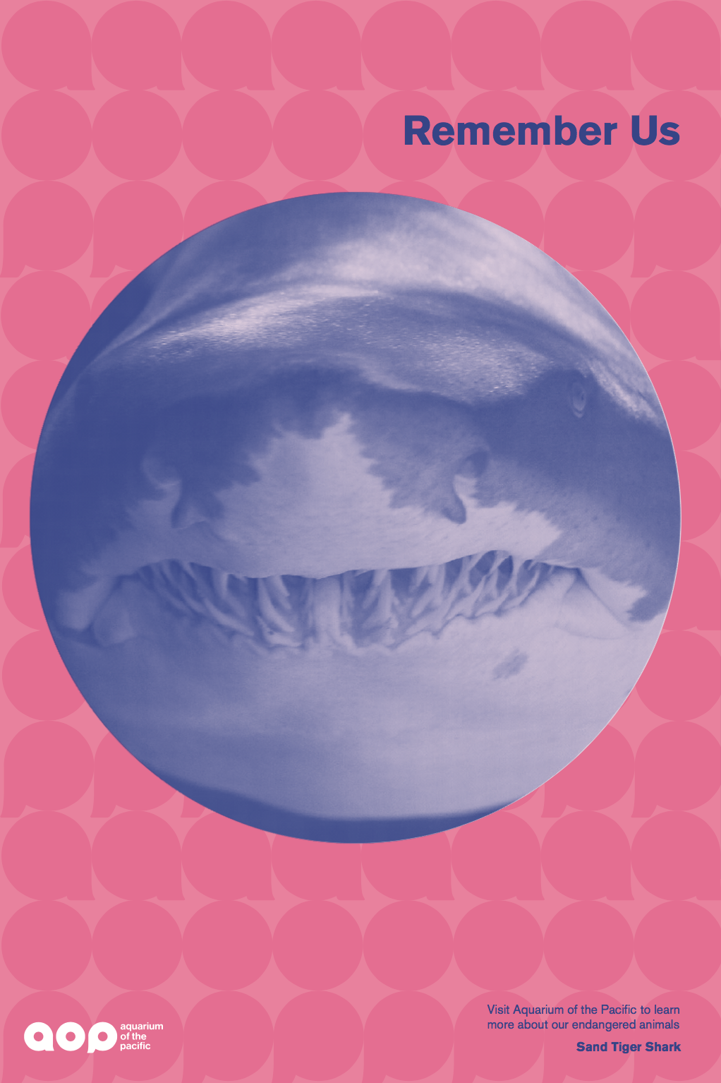
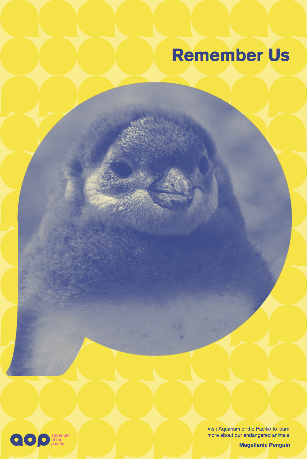
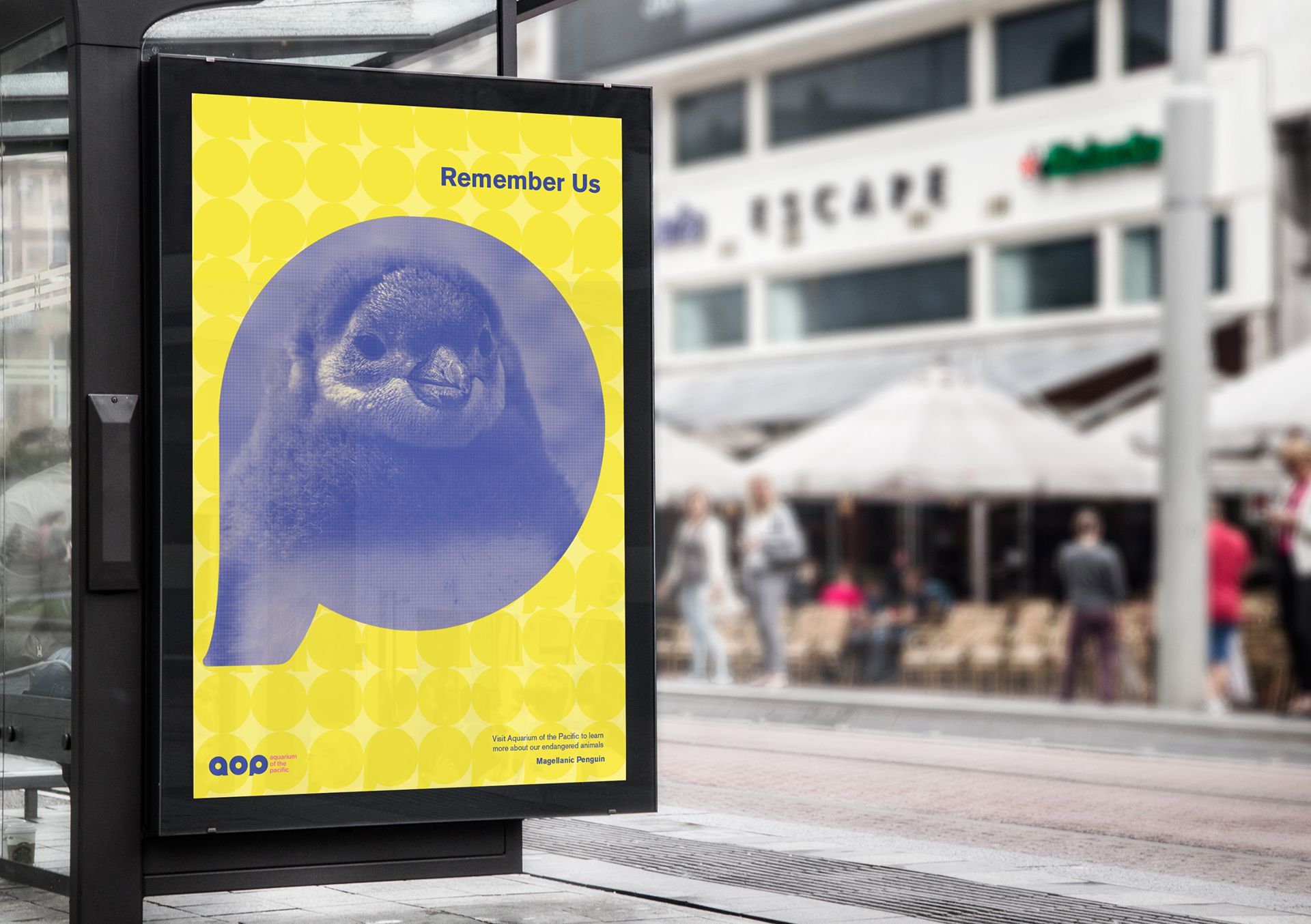
Poster
Poster for promoting endangered animals. Logo patterns are used in the background.
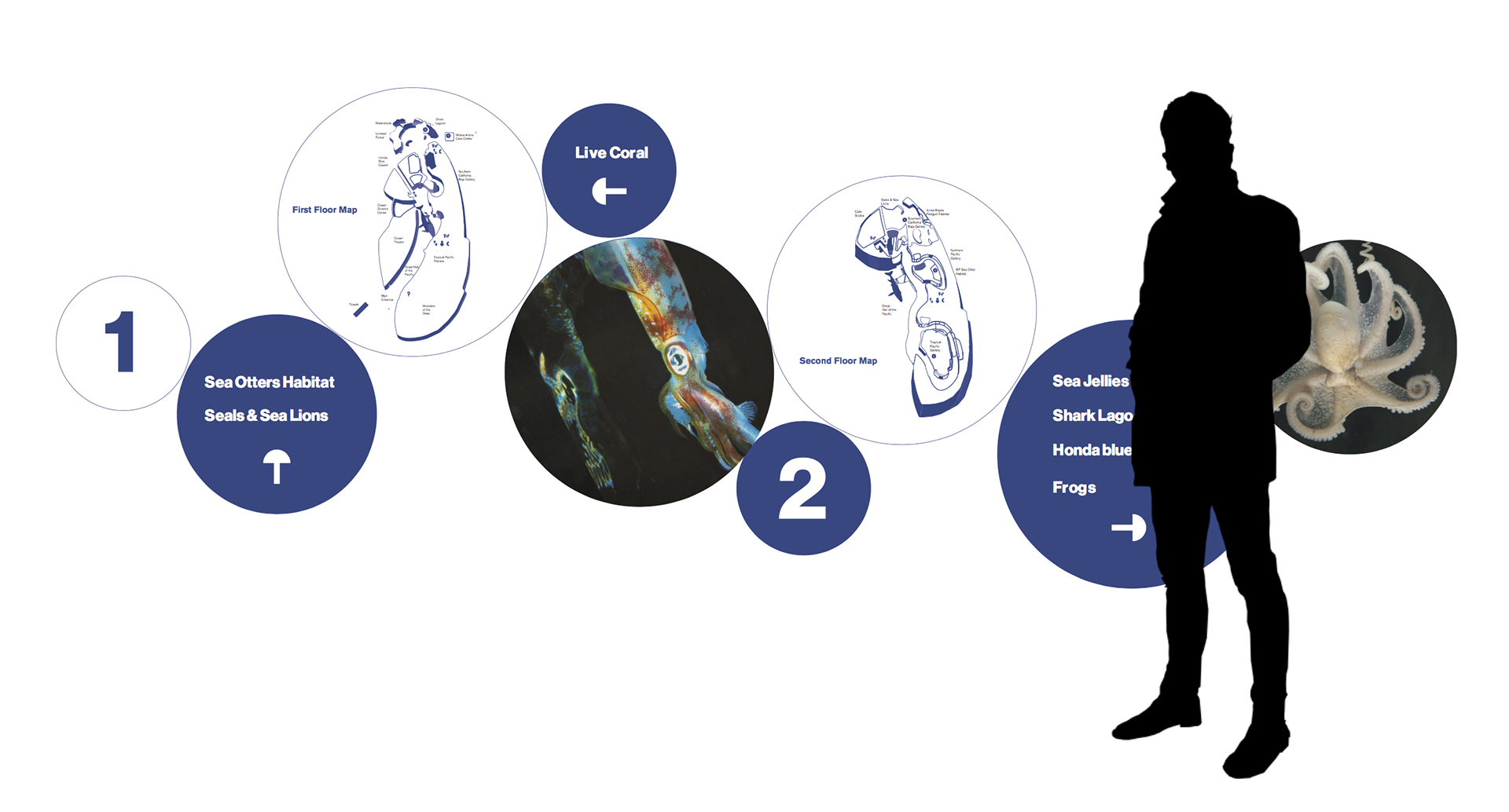
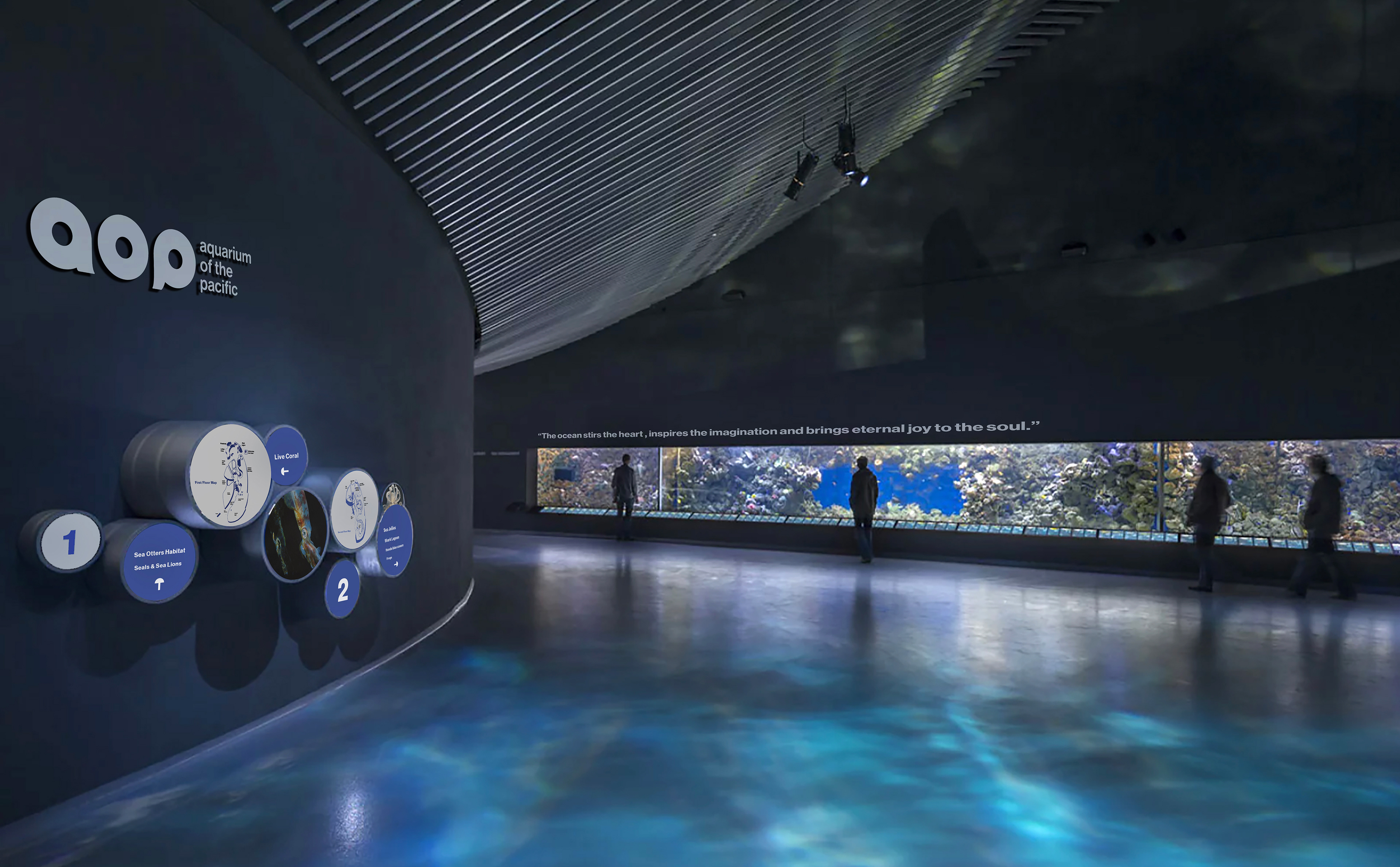
Wayfinding and Signage
Wayfinding are kept circular design language of the brand. It includes maps for 1st and 2nd floor and direction for where some of the highlighted sea creatures are.